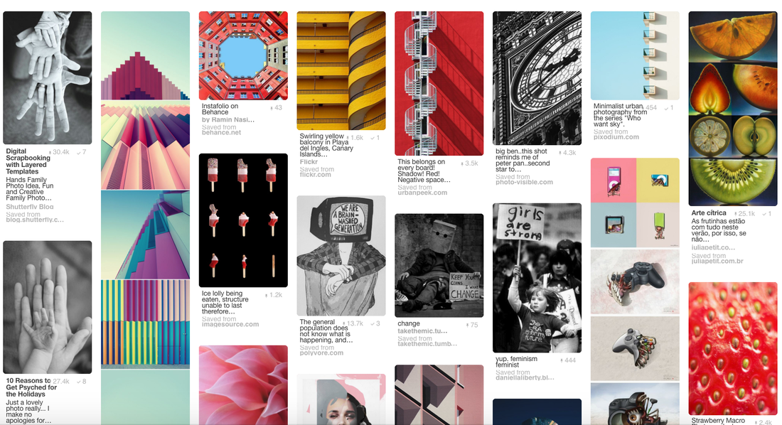
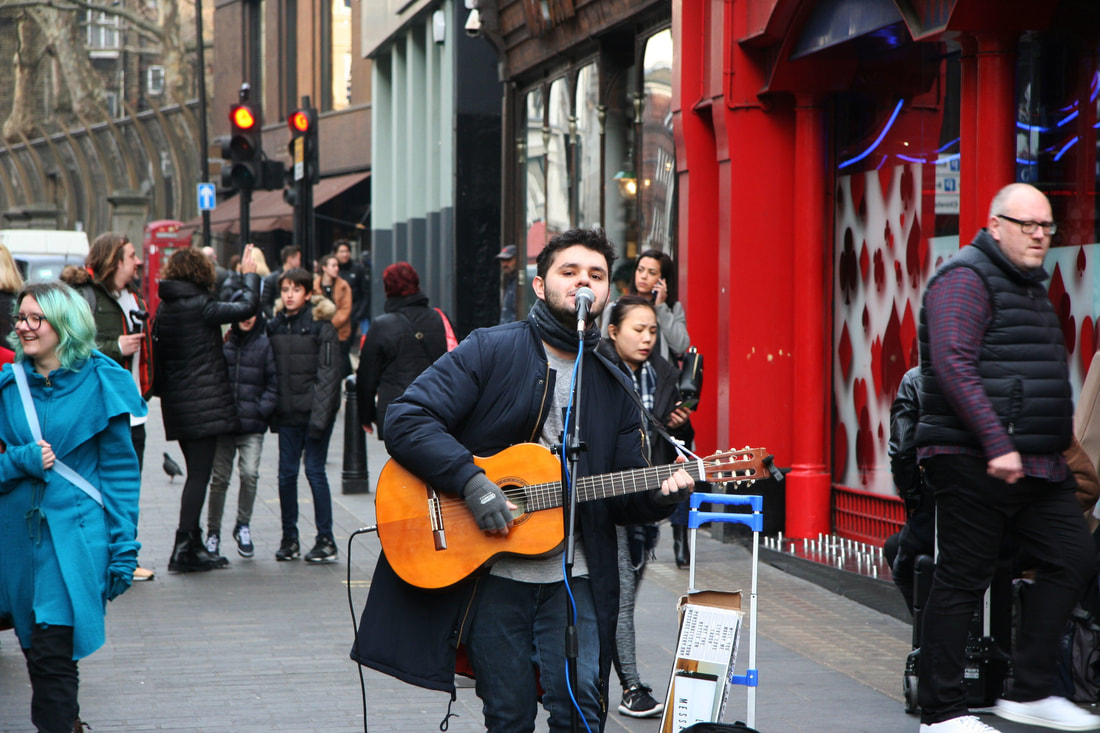
The Structure in Nature
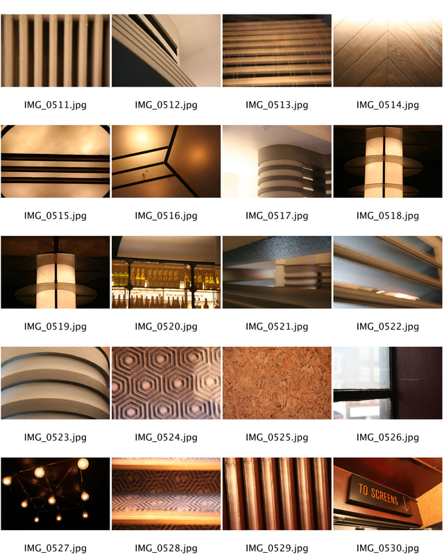
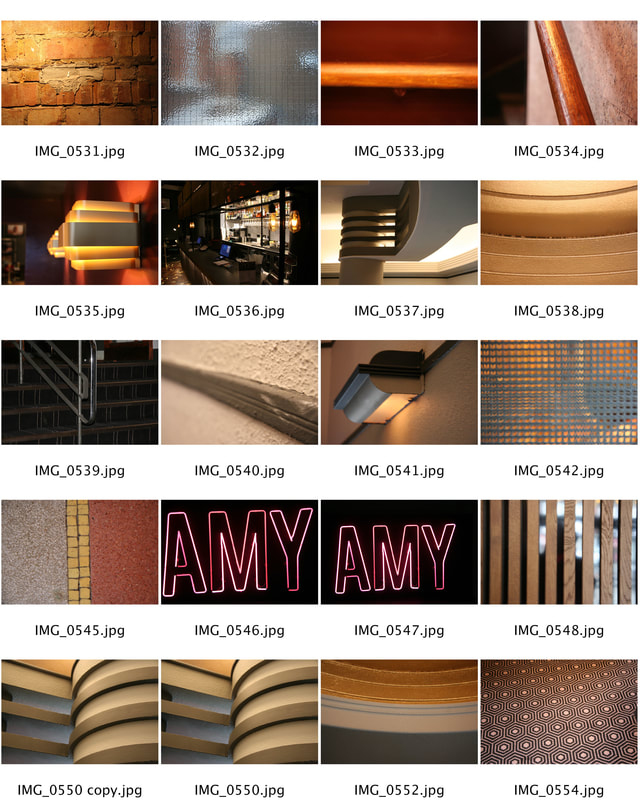
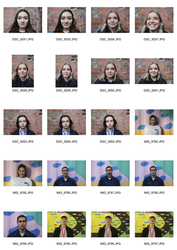
We were told to upload the images taken, making contact sheets alongside my chosen edits. I also created an artist section that demonstrates an understanding of Ho Lee and his visual practise.
Artist Analysis - Myoung Ho Lee
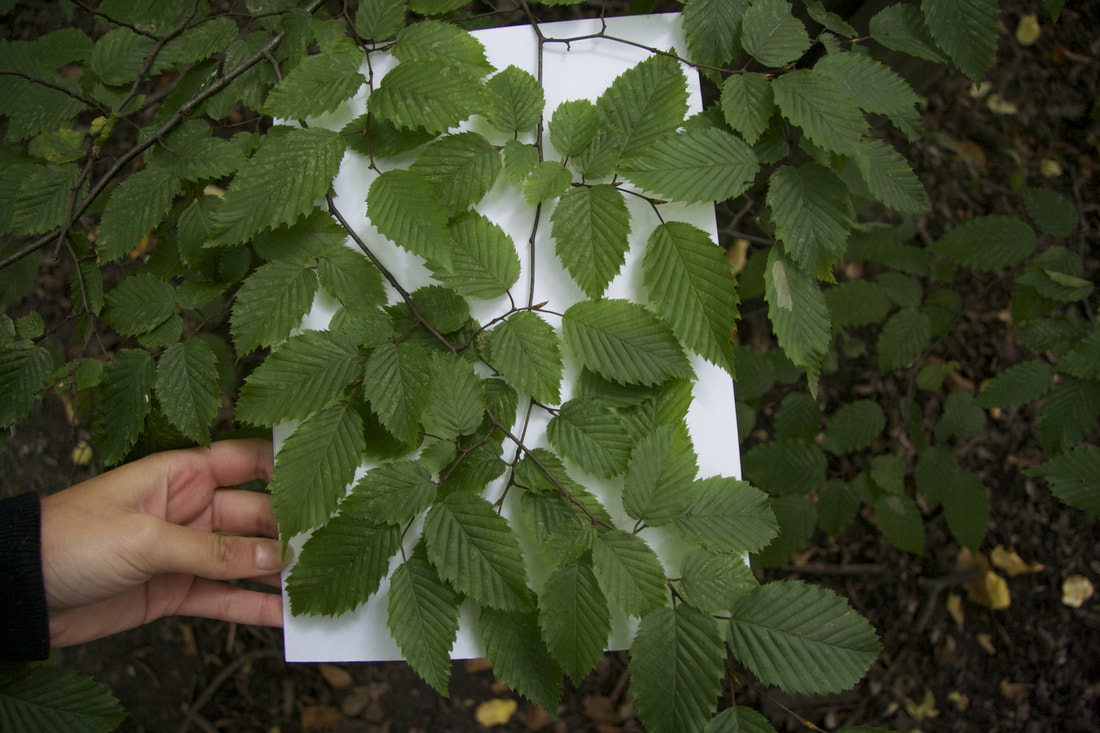
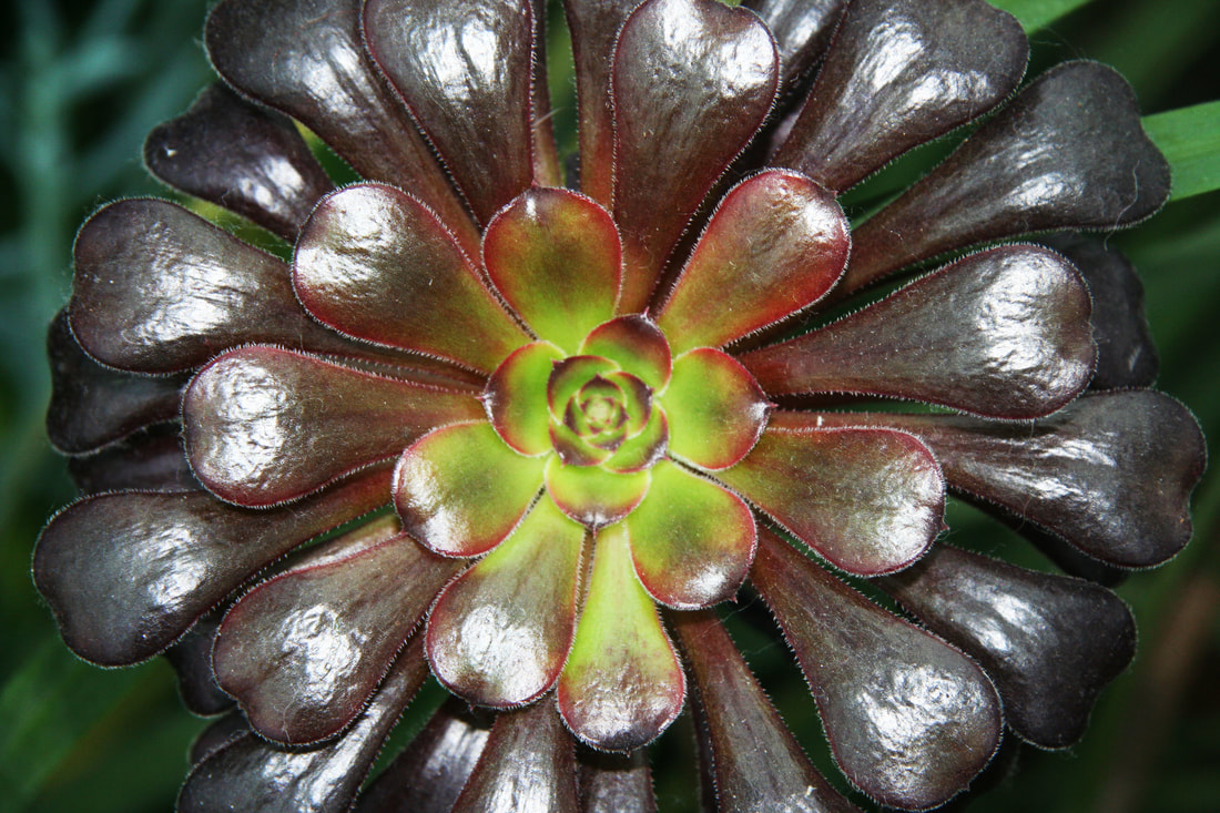
Myoung Ho Lee is a young artist from South Korea, in his series 'Tree' he artificially separates individual trees from the rest of their natural surroundings. Myoung Ho lee has created a series of photographs that makes us question nature, he does this by isolating parts of it to allow us to see how elements of nature look by them selves.
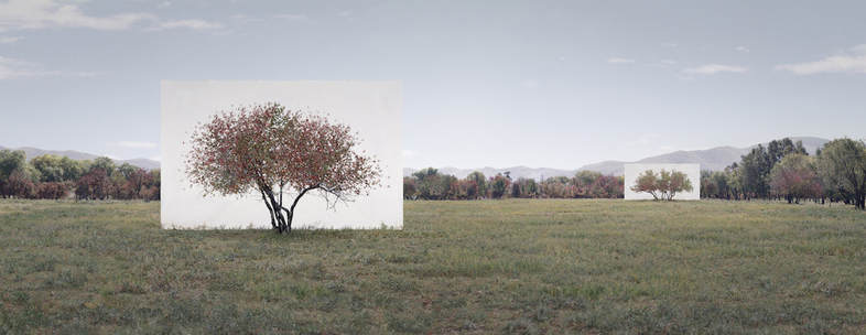
Simple in concept, complex in execution, he makes us look at a tree in its natural surroundings, but separates the tree artificially from nature by presenting it on an immense white ground, as one would see a painting or photograph on a billboard. Lee captures about 4 or 5 photos every year. This is because her rare, unique technique requires a lot of planning even though it seems so simple. Multiple people are involved and vehicles such as trucks and cranes are involved to make the background stable and work well. Her technique is designed to exclude the subject of the image from nature itself.
my Response
|

|
CHOSEN EDITS
|
|
|
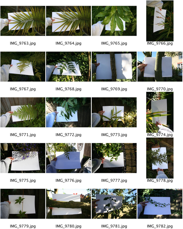
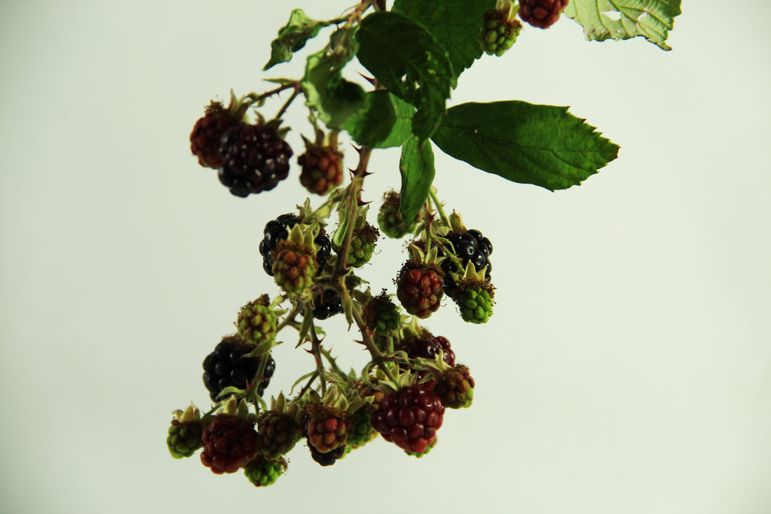
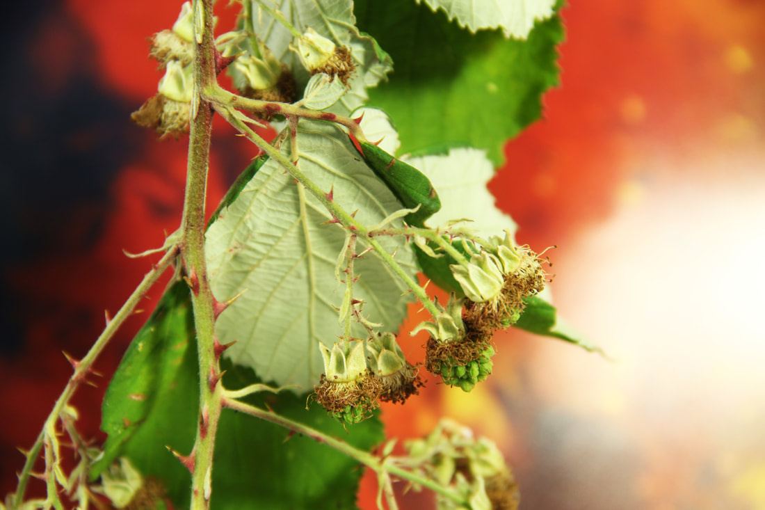
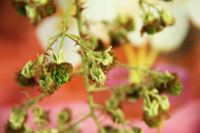
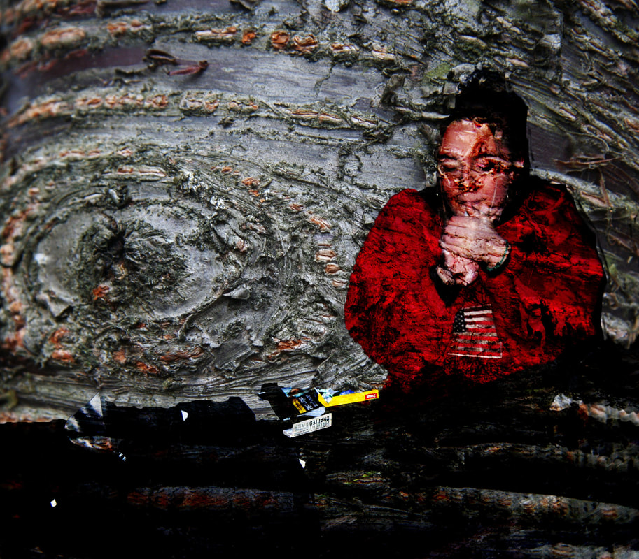
In this photo, the leaves are scattered in a much more compact area. In the image to the right, you can observe that the background was smaller than the branch itself to i could only capture a limited amount of the plant. This could be improved by adjusting the exposure to let more light in. This would make the photograph lighter. A hand is shown in the right image. Next time, I will make sure that the photo is just made up of plants to make it seem more realistic in recreating the artists work. |
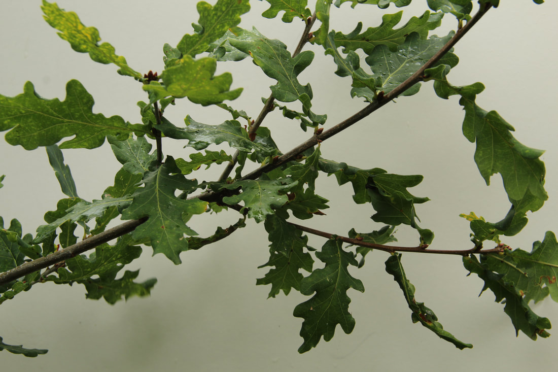
The colour in this photo is much more abstract to the photo to the left. The difference in this photo is that it was shot from further away. This photo would have been much better if I followed the idea of the artist where no hands are shown. This would of made the recreation more realistic. The proportion of the structure of the image contrasts to the photo on the right because in this photo, more white areas are shown in the image and more leaves are placed in the bottom part of the image.. |
Field Works
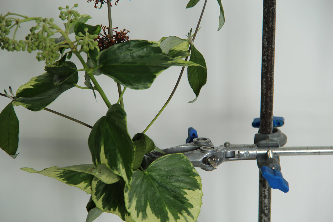
Using the backdrops and the scientific apparatus provided we were told to use our own flowers to create an artistic representation of their natural structure to show the natural beauty of the plant and also the context behind the image creation.
Technical Focus
|
|
CHOSEN EDITs
|
|
|
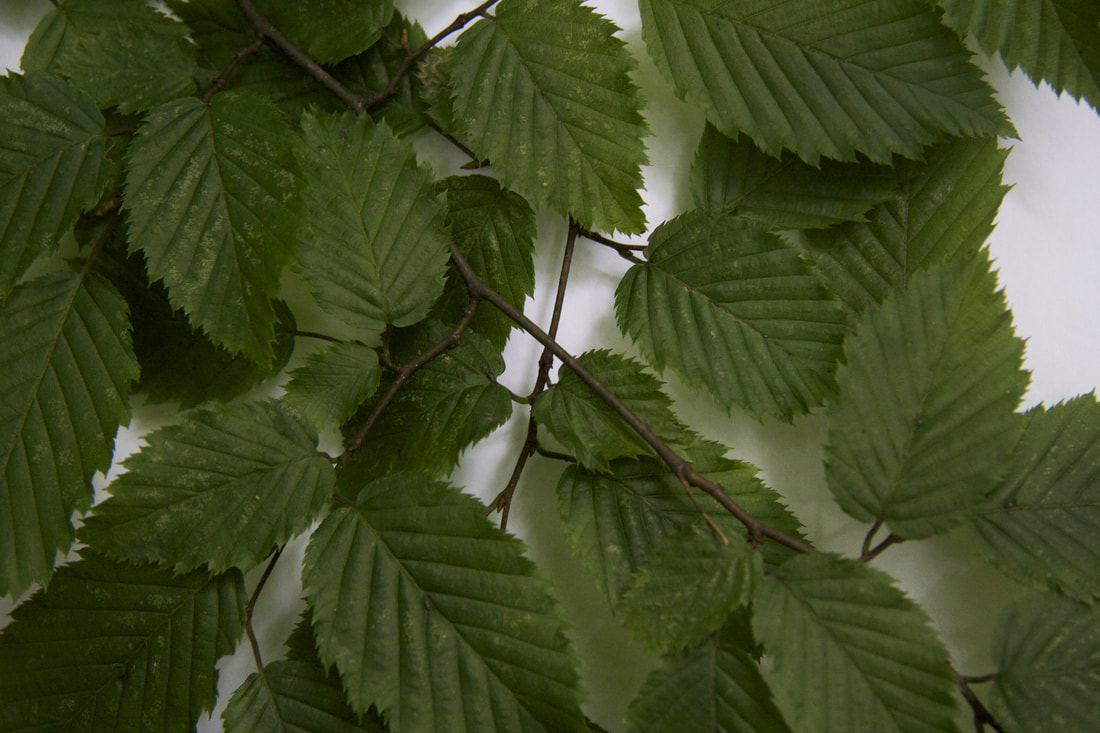
In these photographs, aim was to really objectify the plants. I think that I have done this well in both photographs. The first picture, of the green leaves, was shot with a long depth of field, allowing the camera to focus all of the image. |
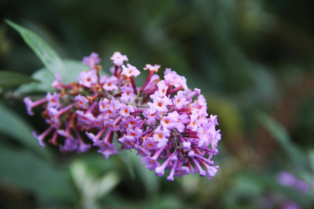
The second image of the purple flowers was shot on the macro setting, allowing the camera to create a photograph which picked out the chosen point and focusing on that. This creates a blur in the backdrop of the image. |
Artist Analysis - Sanni Kannisto
Today we replicated the ideas of photographer Sanna Kanisto. She goes to the rainforest for 2-3 months to take photos. She stays at Scientific stations and uses their equipment to take photos. She has been doing this since 1997. She takes a lot of photos, sometimes with herself in the frame. Here is an example of her work:
|
|
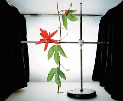
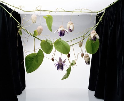
Sanna Kannisto is a photographer from Helsinki, Finland who documents her deep interest of nature through photography. She says ''she is inspired by biology which is definitely reflected in her work''. For example Kannisto often keeps apparatus and equipment in her shots, this shows they have some significance. She loves to explore the idea of both science and art in one photo. The juxtaposition of the man made elements (equipment) of the photos with the detailed plants,flowers and creatures is interesting as I would argue it makes the natural elements of the photographs appear more beautiful. I think her intentions are with these images is to expose the beauty of nature by taking it out of its normal environment so we can see it in a different light.
My Response
|

|
CHOSEN EDITS
|
|
|
In this task, we were told to recreate the work of Sanni Kannisto. In the studio, we set up a replica set up to Sanni Kannisto. The photos that I shot in the studios were supposed to replicate Kannisto's work and I think that I have done that to a good extent. The depth of the field was set to a high so I could get every single area of the frame and the plant in focus in the image. |
In this task, we were told to recreate the work of Sanni Kannisto. In the studio, we set up a replica set up to Sanni Kannisto. The photos that I shot in the studios were supposed to replicate Kannisto's work and I think that I have done that to a good extent. The depth of the field was set to a high so I could get every single area of the frame and the plant in focus in the image. |
My Ideas - Natural on Fake
This is my response. I have decided to add a background of artificial plants behind real ones. This creates a contrast in the images. I wanted to try and create something that I has not seen before.
Chosen Edits
|
|
|
These photographs are my response own response to Sanni Kannisto. In these photos, you can see that I have added in artificial plant images to contrast with the natural green plants in front. |
These photographs are my response own response to Sanni Kannisto. In these photos, you can see that I have added in artificial plant images to contrast with the natural green plants in front. |
Experimenting with the ISO
ISO is one of three determining factors of the exposure of a photo, along with aperture and shutter speed. These two affect the lens and exposure time respectively, with the ISO affecting the sensor (or film). To be more specific, the ISO determines how well exposed a photo will be by changing the sensitivity.
1. With your camera on Manual (M), preset your shutter speed and aperture. (eg.1/60 & f8)
2. Set your white balance to daylight
3. Set up your composition
4. Focus (this should be on Manual too- MF)
5. Photograph the same composition, changing your ISO each time (eg. 100, 200, 400, 800 etc)
6. Observe how the exposure changes. what gives you the best exposure
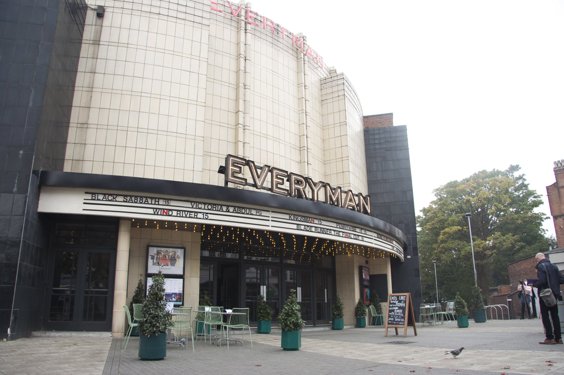
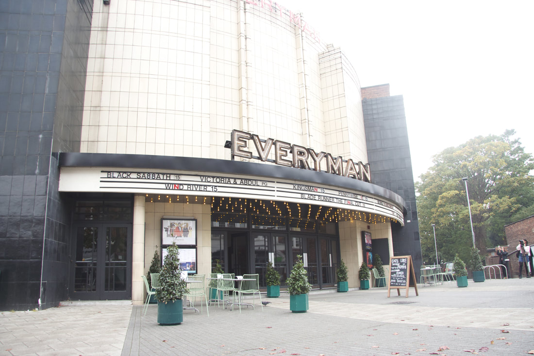
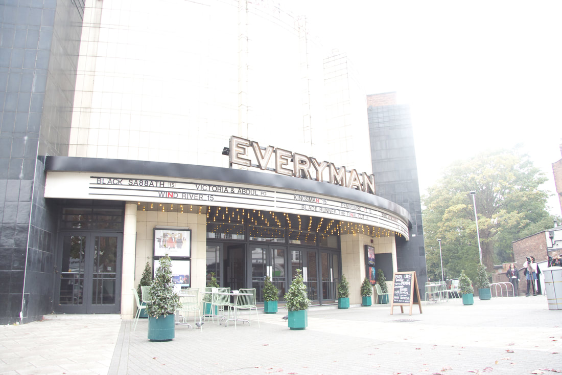
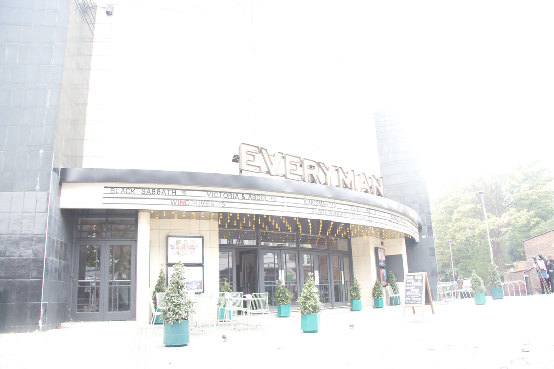
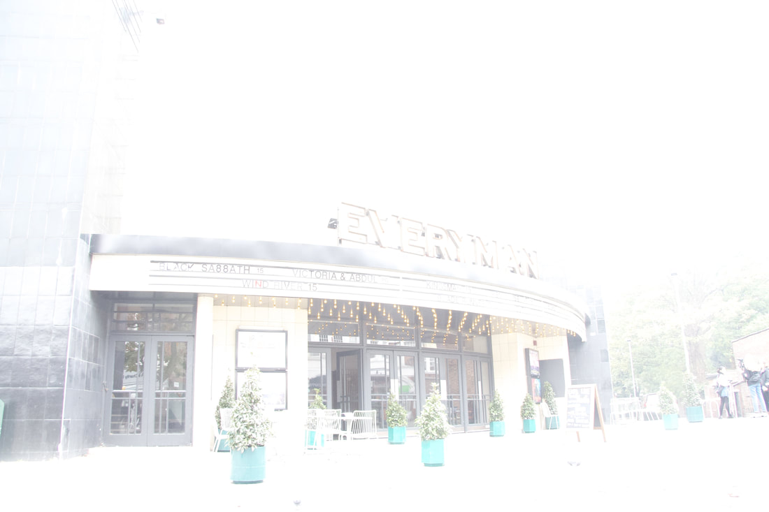
I shot these set of images near to the Everyman Cinema in Muswell Hill, N10. I decided to choses a slighly darker area just to experiment with the ISO. The results show that the picture (left) was the lowest (100) ISO was the darkest and the picuture (right) with the highest ISO (1200) was the lightest picture.
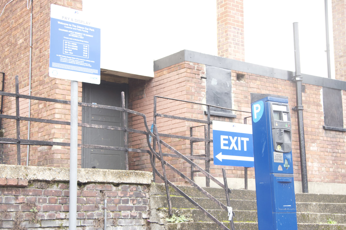
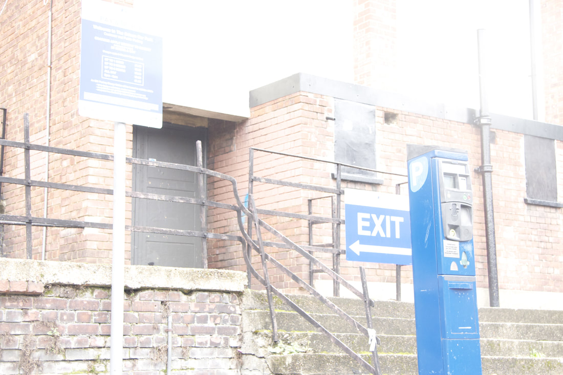
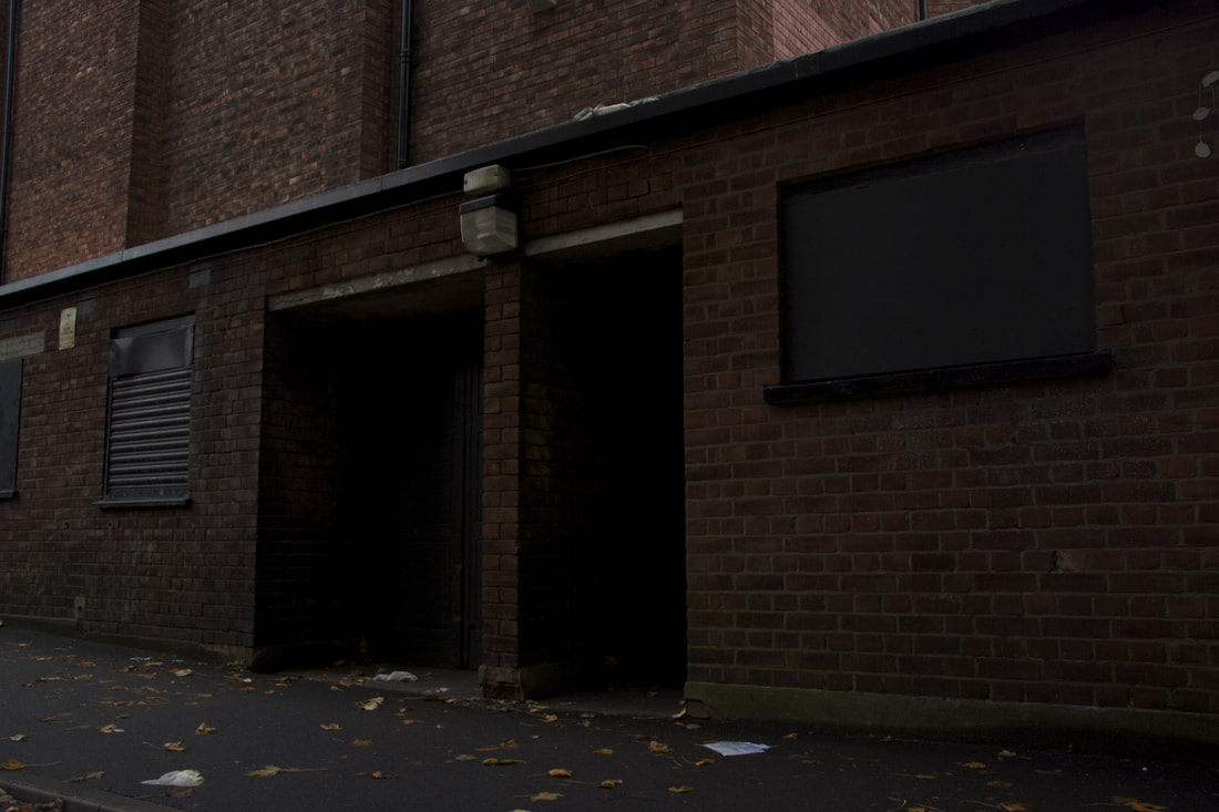
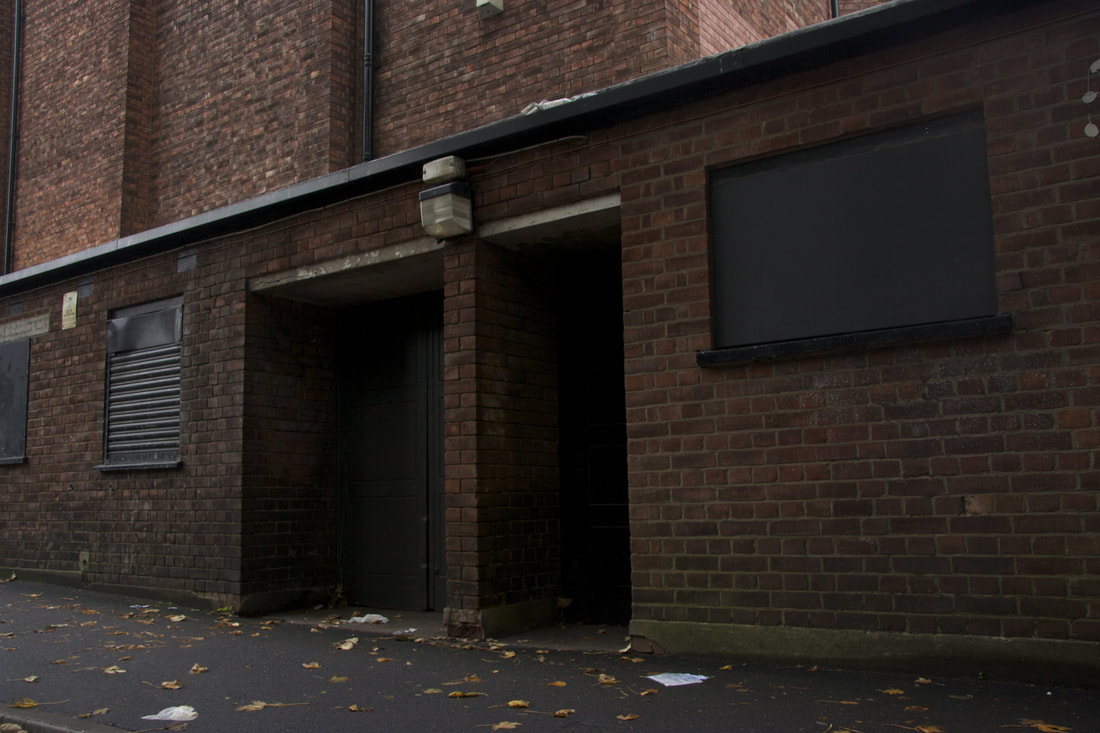
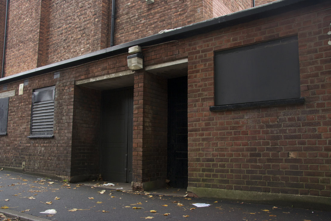
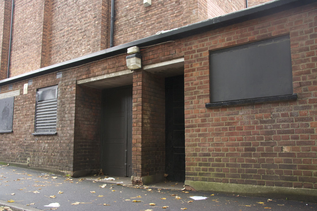
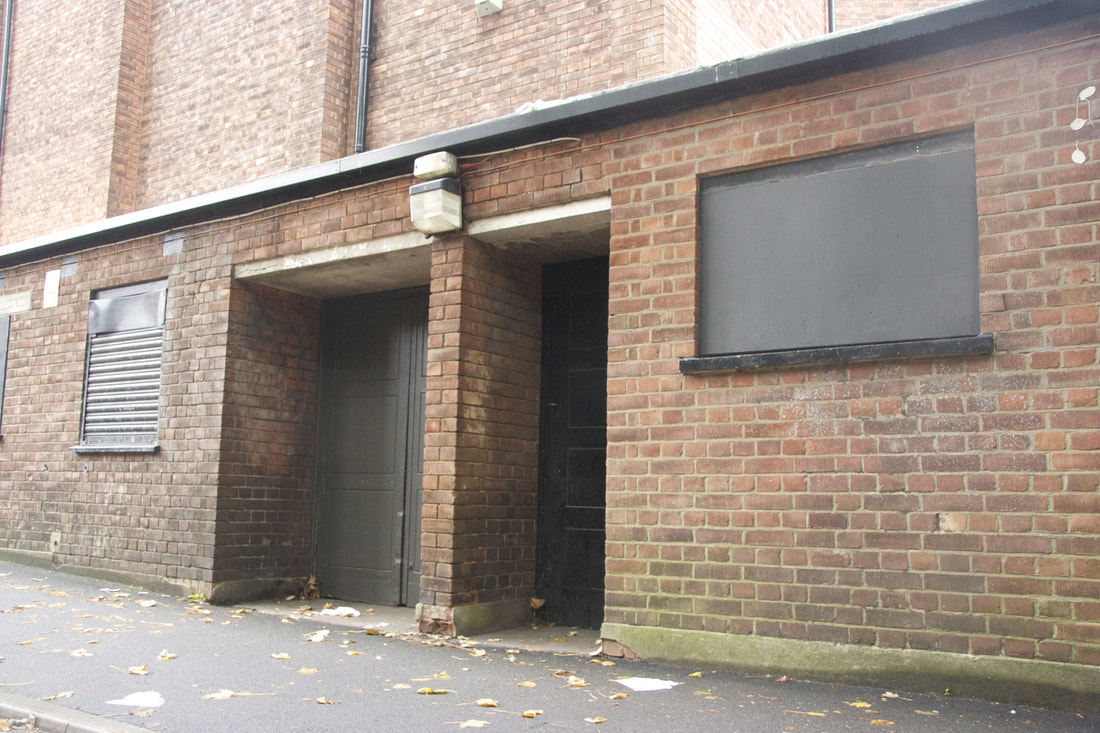
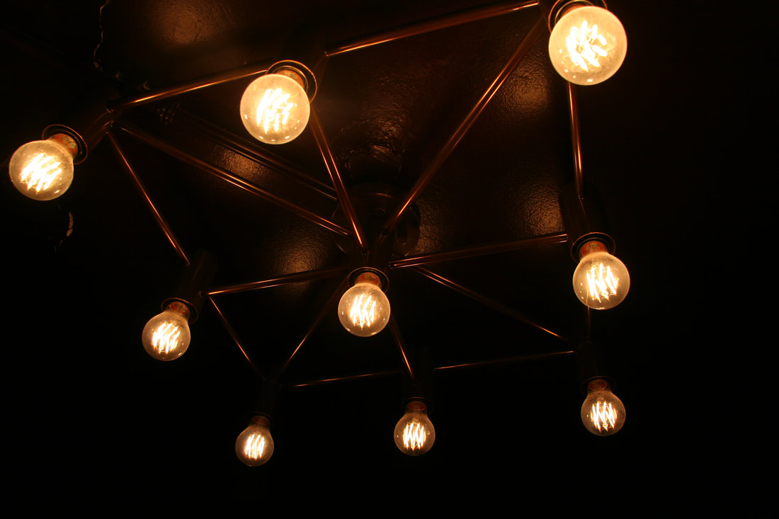
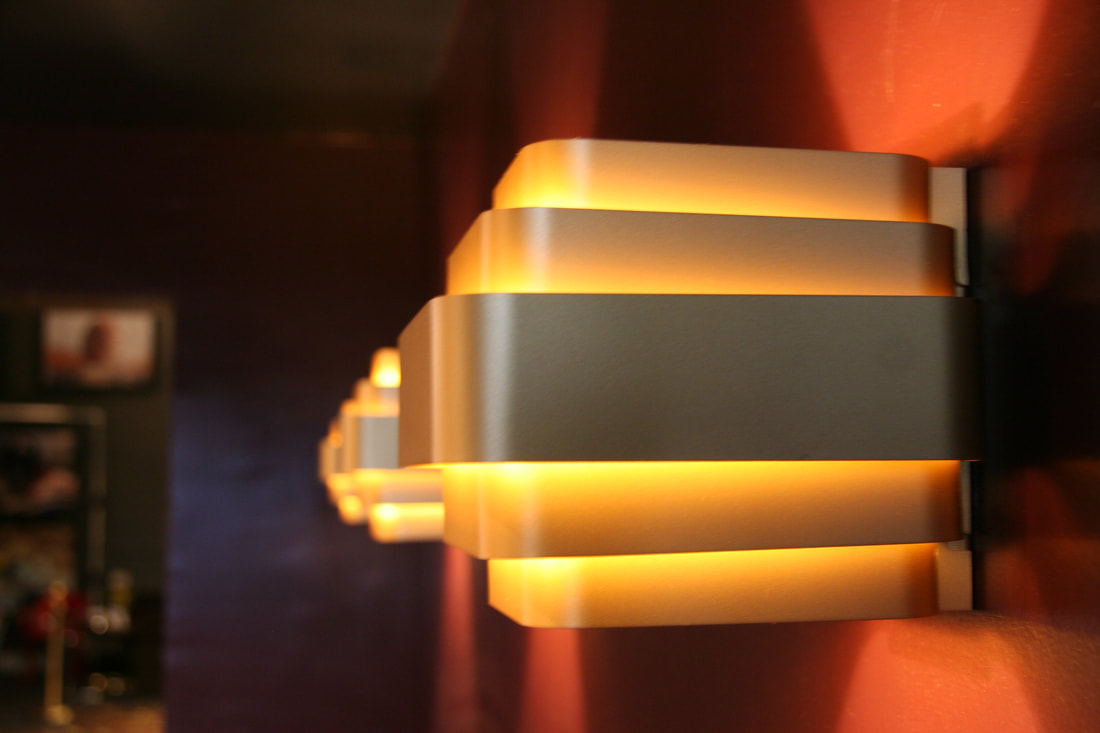
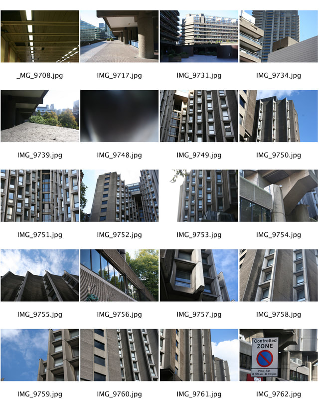
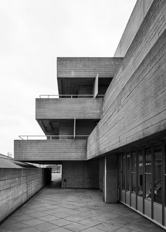
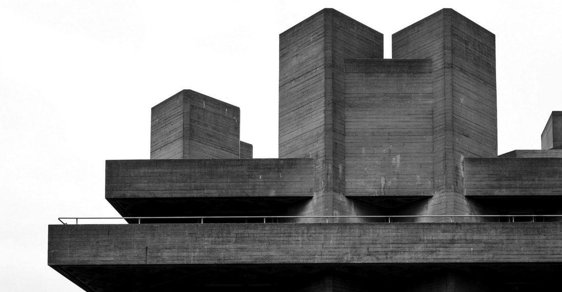
Urban Architecture
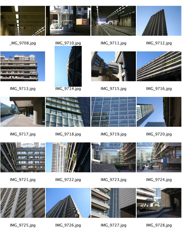
We were told to visit brutalist buildings and experiment capturing the structural makeup of brutalist architecture. Respond to the work of Simon Phipps and take a series of pictures that have a strong emphasis on line, perspective and angle.
vintage cinema
|
|
Edited Images
|
|
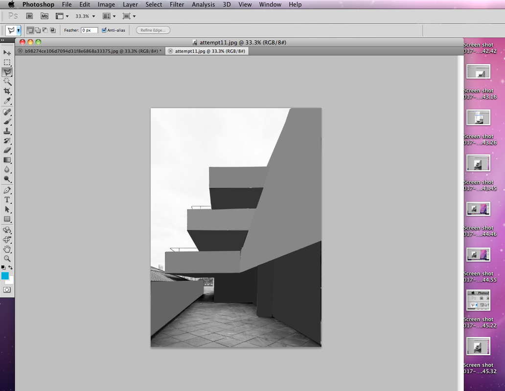
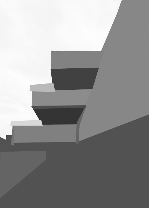
The photos that I was asked to take were subjected to Architecture. My edited photos were my best and favourite images about the task. They show a clear understanding of Architecture and an unusual approach to design.
Brutalist Structure
In the early 20th century it was felt that the camera was the best tool to document the industrial revolution. One way progress and industry was apparent in our environment was the rapid changes happening in cities, particularly in the western world. Photographic technologies and the camera's ability to quickly capture the construction of the modern world perfectly reflected the speed and modernism of the time.
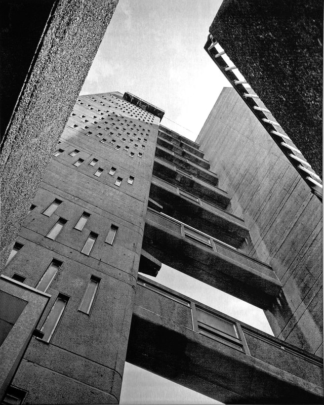
Artist Analysis - Simon Phipps
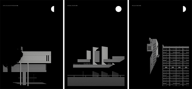
Simon Phipps grew up in Milton Keynes, and has spent the last 15 years photographing and documenting Brutalist buildings in the UK. His series of photographs called "Brutal London" is an invitation to look at a range of brutalist buildings around the city from a range of angles and areas. Phipps intentions for this collection is to simply share his passion for Brutalism, but also share with us what he deems are the best Brutalist buildings in the city. Some of the structures he has photographed are very well known such as Trellick Towers, and some are just ordinary housing spaces.
|
|
|
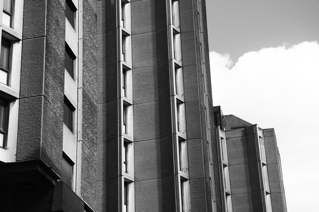
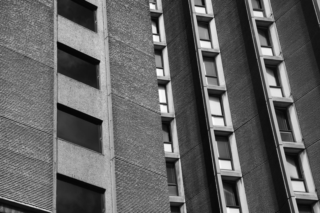
Phipps photos are black and white as I feel this makes the patterns and textures of each building stand out. It reveals the materials the buildings are made from, but also detailed patterns of each structure. I do not feel colour is necessary with these photographs as I feel colour would take away from the sense of 'rawness' brutalist buildings have. This series displays the structure of buildings, and how all over London there are many unique designs within the city.
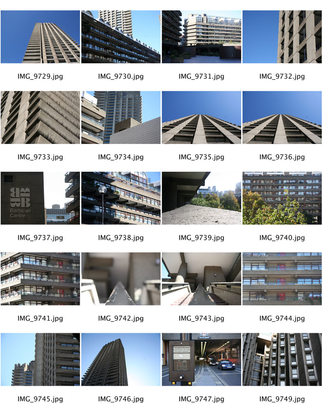
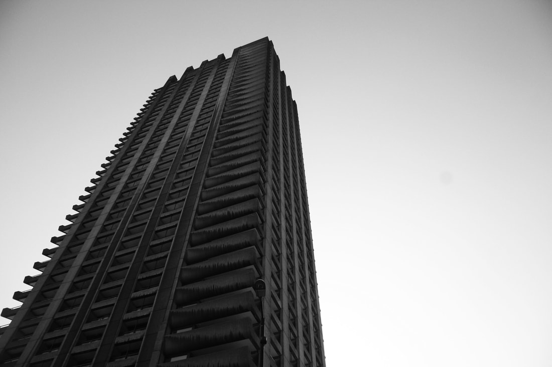
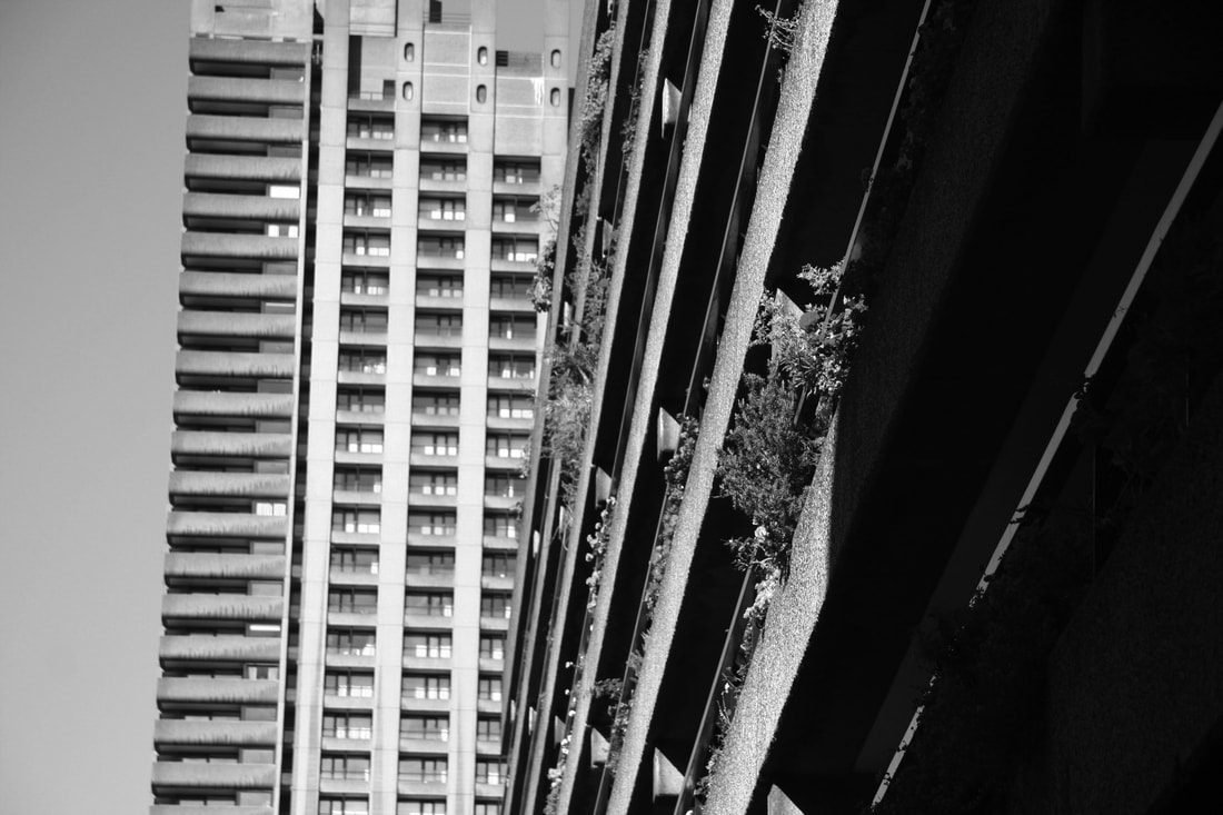
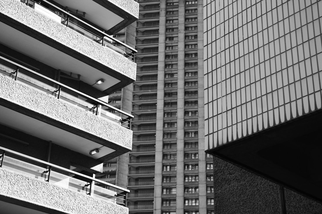
Barbican CENTRE
I went to the Barbican Centre, London. This area is made up of towers and blocks of concrete, built to last for years and a perfect example of a Brutalist Structures.
|
|
Edited Images
|
|
|
These are my barbican photos. I have edited them to black in white to link to the past when they did not have colour photographs, a similar time to when brutalist structures were popular.
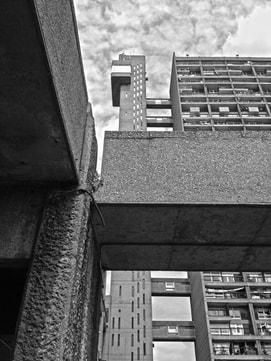
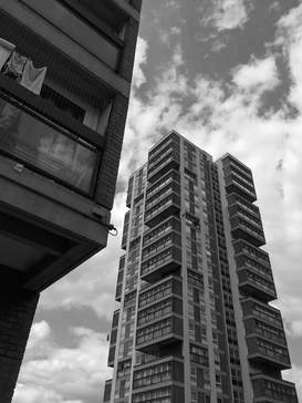
St Giles Hotel
I went to the photograph the St Giles Hotel, London. This area is made up of towers and blocks of concrete, built to last for years and a perfect example of a Brutalist Structure.

|
|
Edited Images
|
|
|
This was one of my favourite images from the visit to St Giles Hotel, Central London.
|
Brutalism Extension
The Brutalism project is a collaboration with Black Dragon press about Brutalism architecture in London. He turns photographs that he has taken in to simplified images in Photoshop and then in turns creates screen prints of his creations. Using the photographs that I have taken, we had to use photoshop to simplify our images and then expose them onto a photo screen to create screen prints of our creations.
Artist Analysis - THomas Danthony
Thomas Danthony is a french artist based in London. Often narrative, Thomas's work is characterised by a clever use of light, bold compositions and a dose of mystery. His work is shown to create a more bold effect on Brutalist Structure. He takes photographs of structures and edits them so much so create a silhouette type of image with the buildings.
This collection of images is the work of Thomas Danthony and the Black Dragon press who came together to create 'The Brutalism project'. Danthony's intentions were to explore various Brutalist architecture in London, but portray it in an unconventional way. Consequently, using Photoshop Danthony has edited his images, which has made them all look very simple. This is due to the fact in every photo the sky is black and there is not much going on in each image.
Process of how it's made

1st response
|

|
evol Response
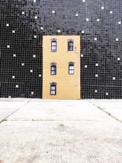
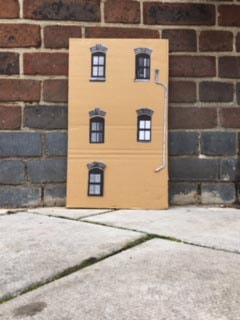
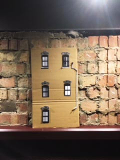
German street artist EVOL transforms banal urban surfaces into miniature lifelike buildings. He is like an urban planner, but unlike the others, he creates a city within the city. The artist uses complicated stencils and photographs to quickly transform power boxes, and other worn urban surfaces into miniature apartment buildings or other structures. By drawing tiny balconies and satellite dishes onto the side of an electrical box, he is able to turn it into a realistic tiny skyscraper.
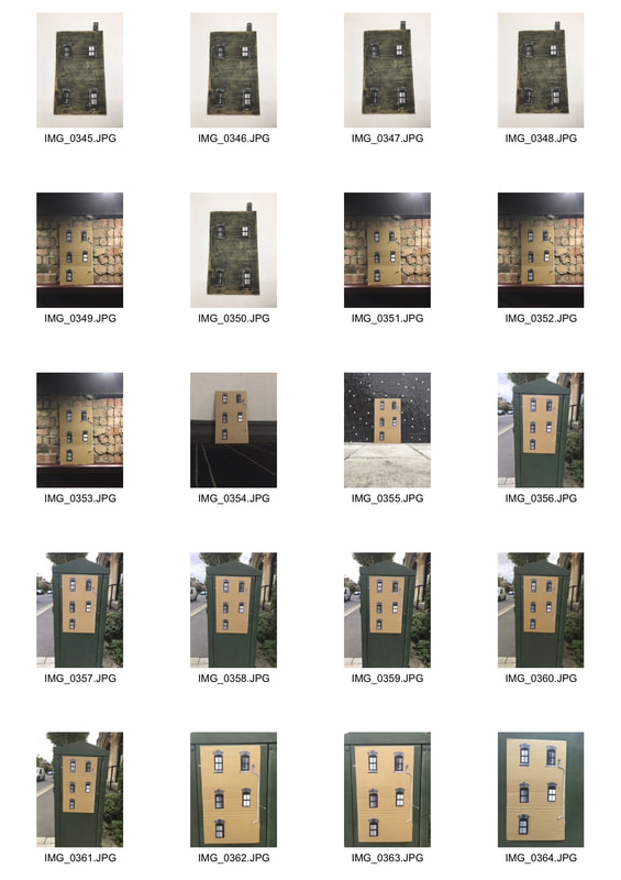
|

|
response
|
|
|
|
www ebi
|
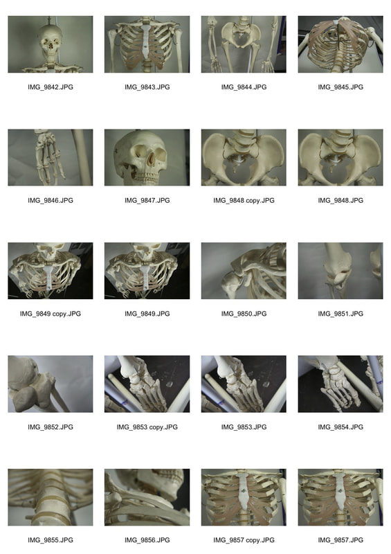
Structure of the body
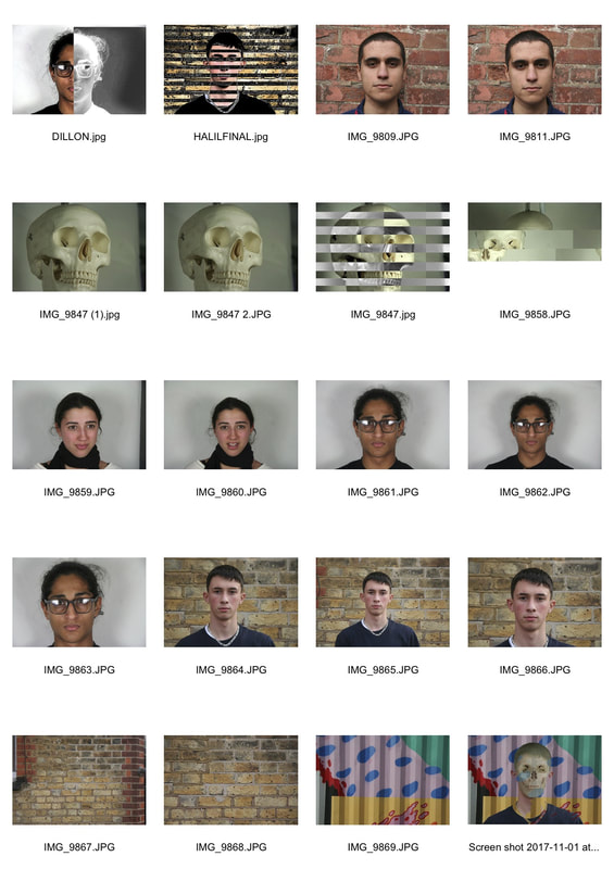
The task was to set up the skeleton and bones in the studio and photograph them on a white background. Then take a series of portraits of my classmates. Finally, using photoshop and other experimental techniques, merge the portraits with the skeletons and bones.

|
|
my RESPONSE
|
|
three strands
Once I had completed the tasks set by your teacher I needed to consider three starting points for my own response to the theme. Each of my ideas must be supported by a rationale, link to an artist and my own images.
city structure
The City of London is one of my favourite places to shoot photos. The 'Structure in the City' strand represents the different shapes, sizes and textures that are found around the city. I travelled from The Shards all the way through the city to Liverpool Street, passing landmarks such as London Bridge, H.M.S Belfast and Tower Bridge.
ARTIST ANALYSIS - Allen klosowski
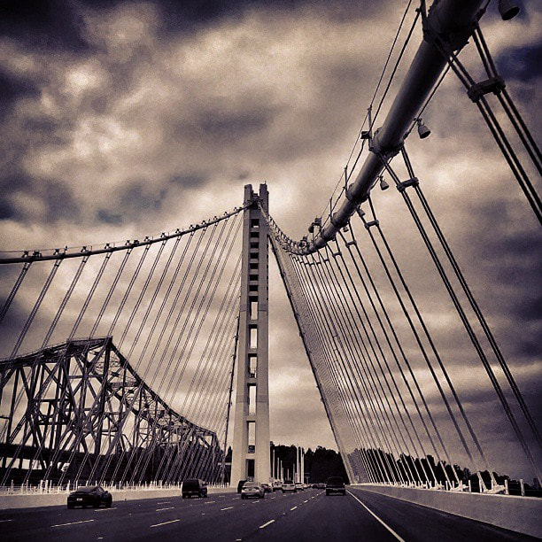
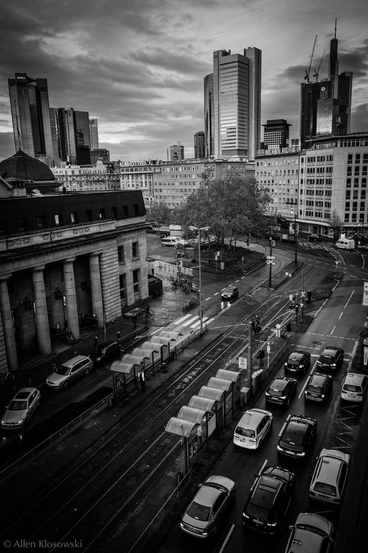
Allen Klosowski is a photographer who is interested in taking pictures of different perspectives of buildings. In some of his work, some of the buildings reflect off other buildings (such as the example shown) or he will take a picture of a puddle which is reflecting a building. His work links to ‘Environment’ as buildings are what make the environment. His intentions are to show that buildings are viewed as the viewer wants to see it: in their own way.
|
|
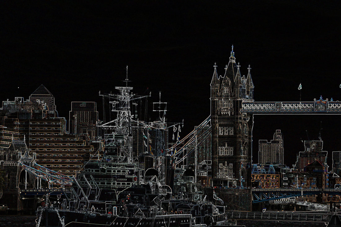
This is a photo I shot near Hays Galleria in London Bridge. The shot captures sights of half of tower bridge and nearly the full length of the H.M.S Belfast Ship. I thought that this photo worked well as the subject of the strand of structure in the city so I decided to capture two famous landmarks and create a photograph. The edit that I used creates a sense of complication in the structure of the photo, this is because it picks out every line of the photo, almost making it look like a drawing. The effect emphasises every single part of structure in sight. The Navy ship's colour connects with the joint of the bridge.
|
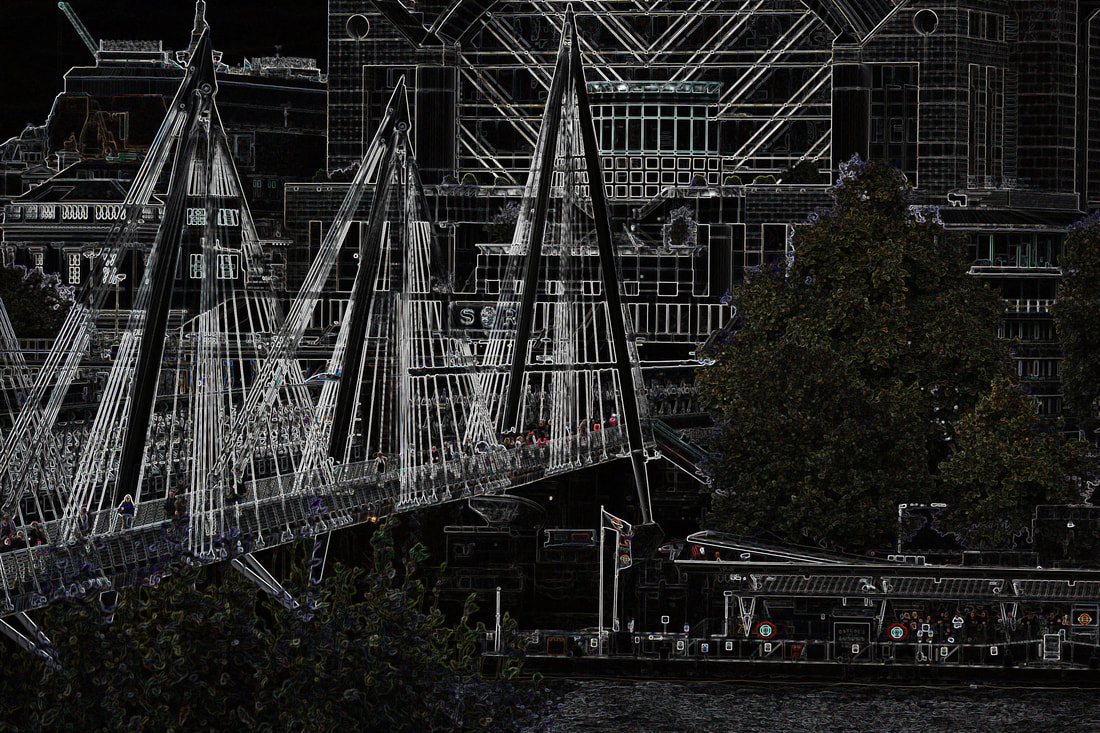
I took this photo at the rooftop of the Royal Festival Hall, Embankment, London. The urban bridge and the green trees creates a contrasting effect on the image. The edit on this photo really emphasises the tiny details of structure on the bridge. This is shown in the multiple lines that are created when the original photo was edited. I feel like the proportion of this image is correct, there are multiple subjects active in the image for example, the bridge, the trees, the river and the train lines. The large building in the middle of the photo at the top creates an interesting symmetrical effect on the image.
|
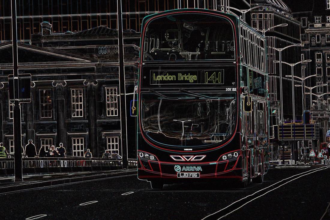
This photo was taken on London Bridge. I decided to capture one of London's most well known transport links, the Red Bus. I feel like this links to the theme of structure as it shows the components of the front of the bus to an extent that is easy to view. Also, I decided to take the shot in this moment due to the vast, victorian buildings in the buildings. This creates a opposing effect in the image, almost like old vs new. The edit on the buildings behind really conveys how detailed they are, even thought they seem quite plain in normal observations. The colour contrast on the bus makes it stand out to the rest.
|
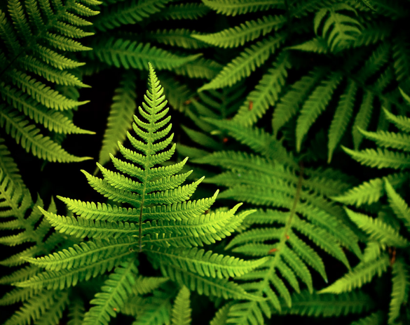
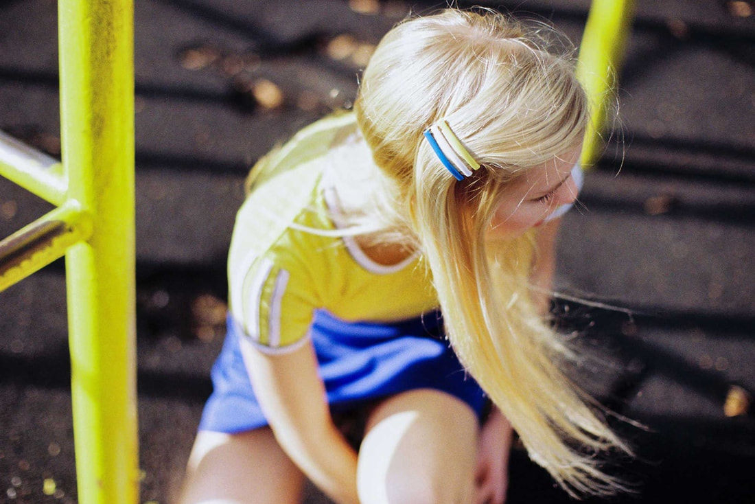
macro shots
This is my second strand. I have chosen Macro Shots as one of my strands because I find the structure of plants very interesting. This strand links tot he theme of structure because up close, macro lens picks out every detail of the plant to photograph.
Artist Analysis - Joni Niemelä
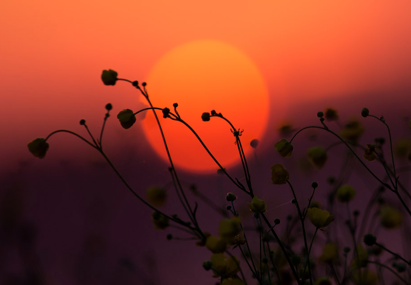
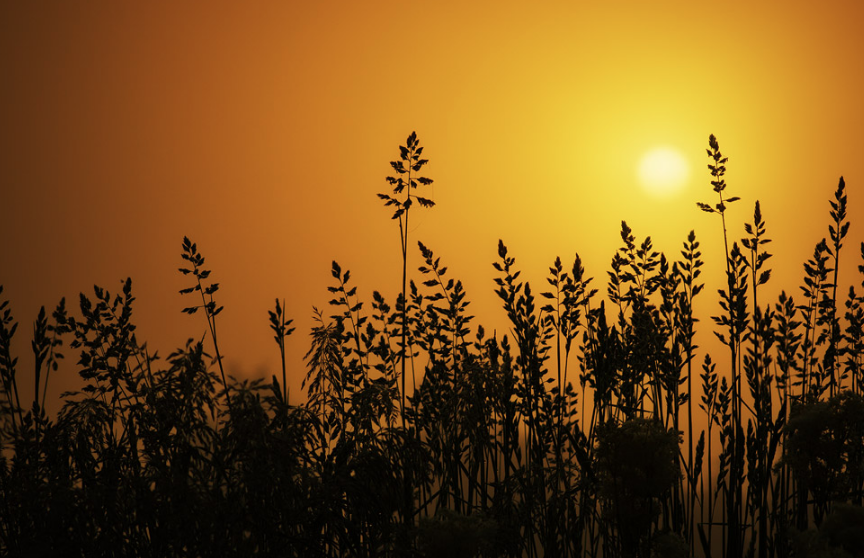
Joni Niemelä is a self-taught fine art nature photographer based in Southern Ostrobothnia, Finland. His work is known for a bold use of distinct colours and tones. Niemelä has been capturing the world around him for over a decade, and his photographs have been published in a large variety of media globally. Though he likes to photograph various things in nature his favourite subjects are world of macro and those little details that usually get unnoticed.
|
|
This photo was taken in the gardens of the roof at 20 Fenchurch Street. I love this image because it really links to the theme of structure as it brings out all the components of the structure the plant. The flower almost looks completely round with the circumference of the plant have a completely opposing colour to the centre. The reflection on the purple pettles makes the plant look like the flower has three colours when in fact it only has one.
|
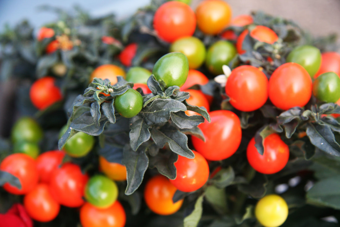
My favourite part of this image is the contrast of colours in the same fruit. The macro shot of the small green tomato in a way reflects on the rest of the image. The background represents grown and the front of the group represents youth and growth. This photo links to the theme of structure as the structure of the plant's fruits grow in a certain formation so that they are capable to expand to full size. The colour of the leaves is similar to the colour of the young grown tomatoes.
|
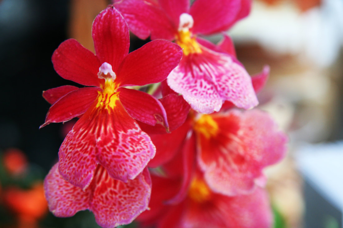
This photo is one of my favourite images. It shows so many varieties of vibrant colours in one image. The macro shot of the yeller centre, surrounded by the pink pettles links to the theme of structure as it creates a simple structure of a plant. The flower almost looks completely round with the circumference of the plant have a completely opposing colour to the centre. The outer part of the pink areas on the flower are covered white. This is a nice contrast of colours in the image.
|
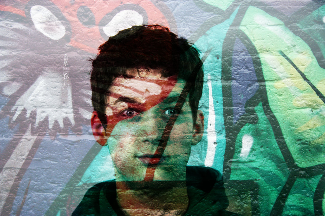
glitch
This is my third strand. I chose the strand of 'Glitch' as I wanted to be creative with my work. This idea gives me the freedom to create my on art. I wasn't sure about this at first but my photographs have worked. I used several models to edit.
|
|
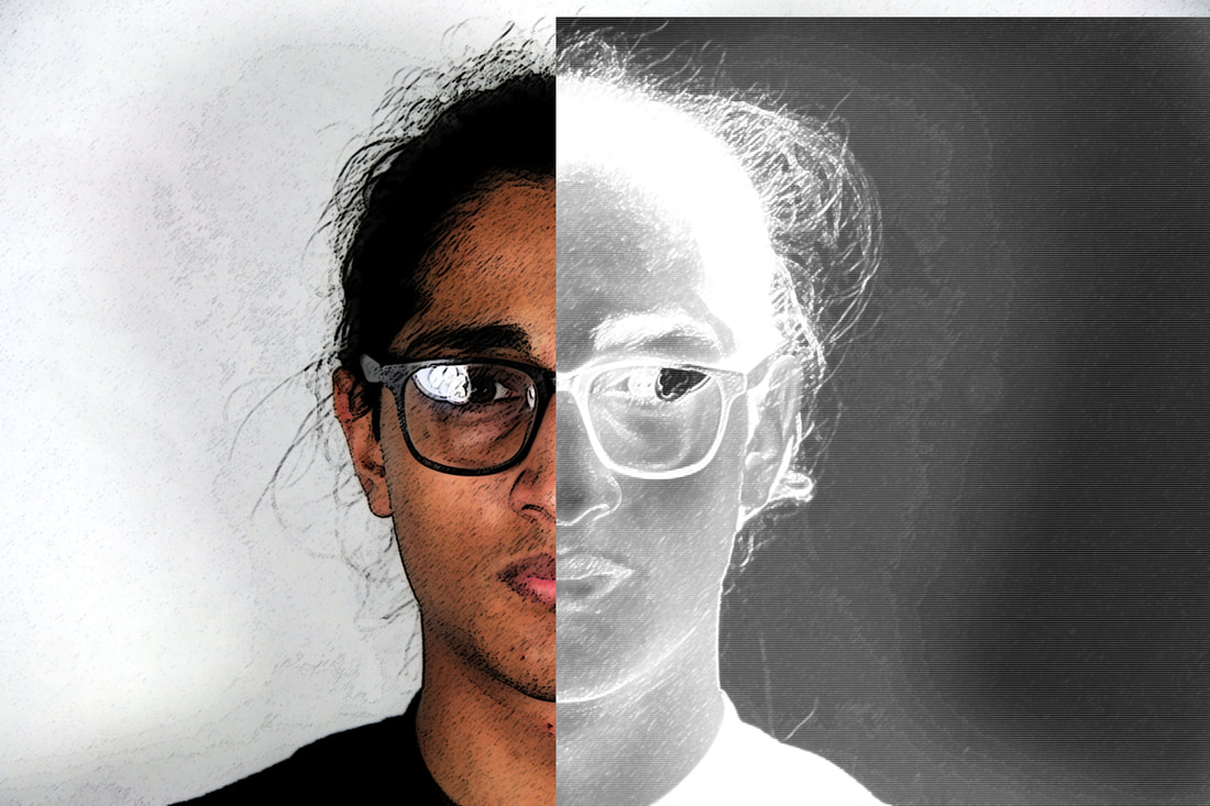
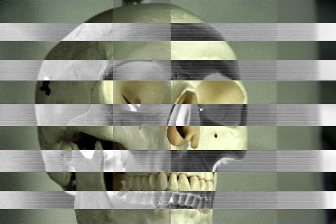
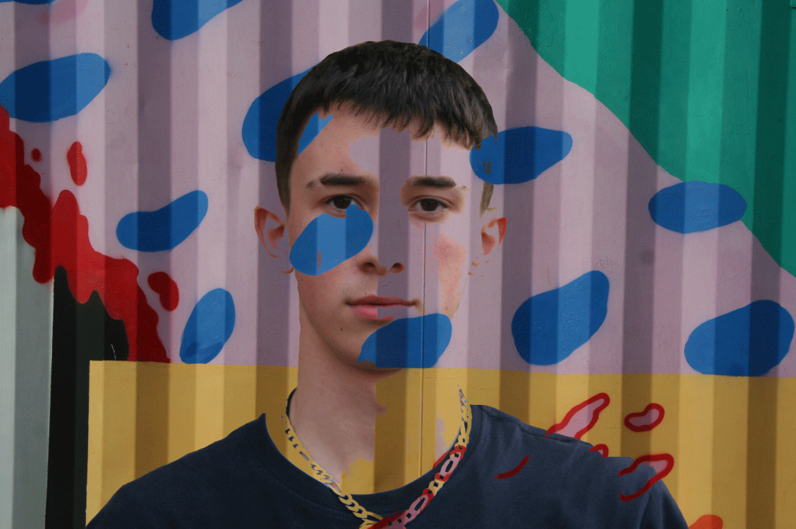
The whole point in this strand was so I could have the freedom of creating anything with just a simple template of someones face. In this image, I used Dillon to create a symmetrical effect on his face, on top of using an X-Ray effect on his skull also. Half of his face is normal, the other half has been edited to create a ghostly effect, looking like a skeleton. His black T-shirt makes the contrast in the other tone, completely white.
|
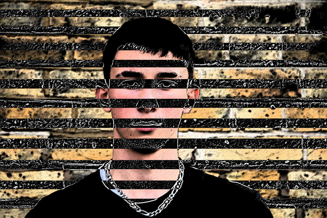
In this photo, I started off by using Text Edit to create a glitch effect on the image. It worked by copying and pasting the image address to other parts of the document to create a glitch effect. I did not think that was very interesting so instead I made create a cartoon effect on my model, using the Poster Edges edit on Photoshop. After that, I cut out multiple lengths of the image to make them black so the final image came out as a pattern.
|

This photo was taken during the 'Structure of the body' task. I made this image by cutting out different parts of the original image and using a sketch edit to replace them. This photo is sort of a mix between the two photos to the left as the X-Ray effect is used on top of creating a pattern in the image. The image works in the way that the subject of the image is skull and I have used a X-Ray effect to crate a final image.
|
The decay of society
I have chosen my second strand because it was my favourite strand out of the three that I experimented with. I think that the flowers, plants and structures of bio diversity can all link very cleverly to the strand of structure. My eight development ideas will be below, followed by my final piece.
I have chosen my second strand because it was my favourite strand out of the three that I experimented with. I think that the flowers, plants and structures of bio diversity can all link very cleverly to the strand of structure. My eight development ideas will be below, followed by my final piece.
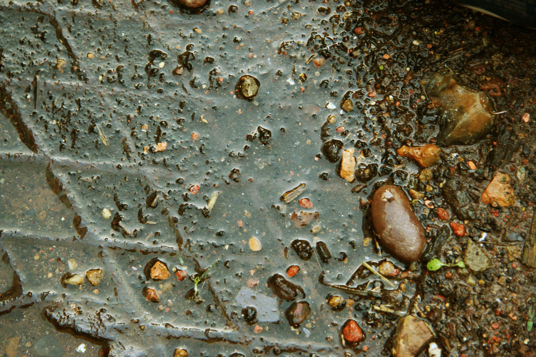
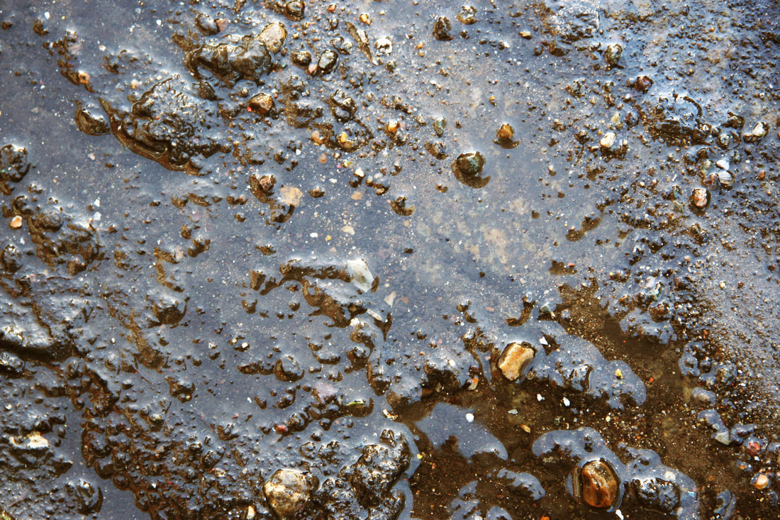
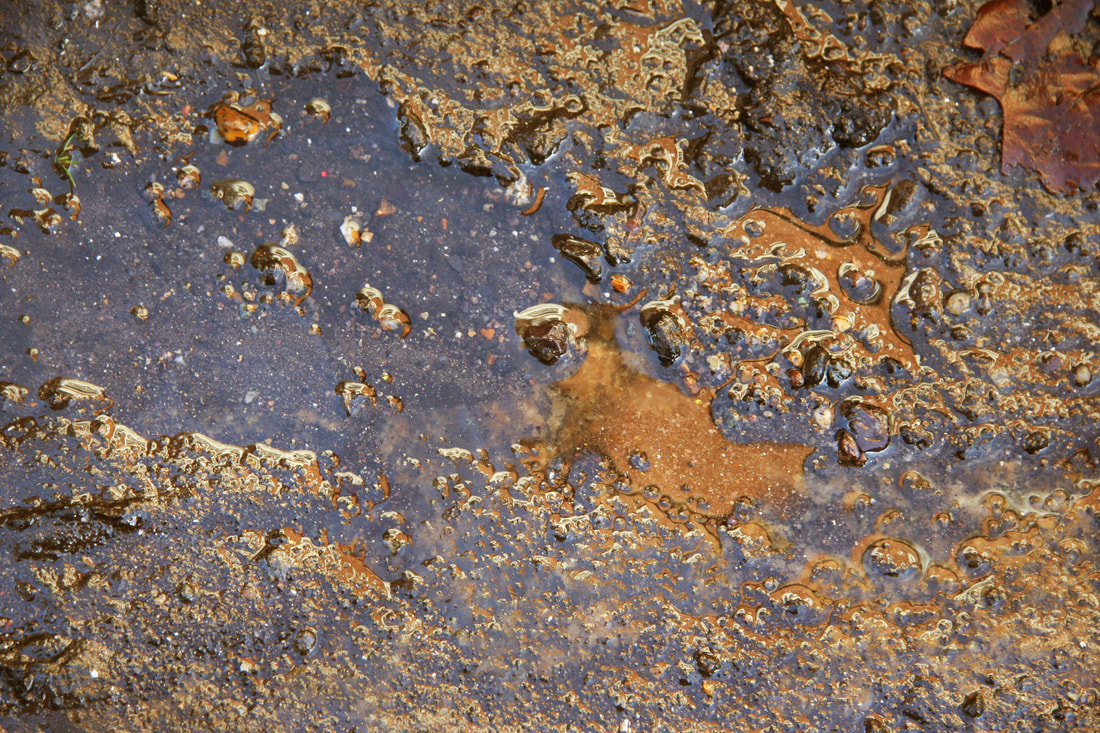
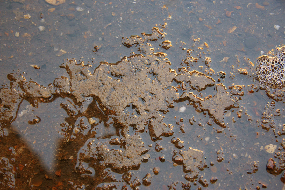
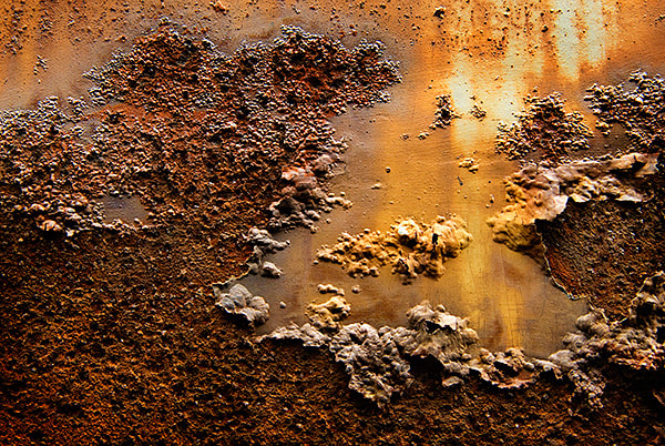
Golden decay
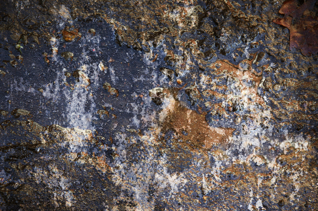
ARTIST ANALYSIS - colin winterbottom
Photographer and educator Aaron Siskind (1903-1991) holds a preeminent place in the history of American photography. Beginning his photographic career in the 1930s as a social documentarian with the New York Photo League, he ultimately radicalized the medium by emphasizing the photograph as an abstract form of expression and an aesthetic end in itself. Siskind taught in New York City's public schools for 25 years before becoming recognized as a photographer and then a gifted pioneer of photographic education. His vision and methods have and will continue to inspire and instruct future generations of artists and teachers.

CONTACT SHEETS
|
|
edited photographs
|
|
|
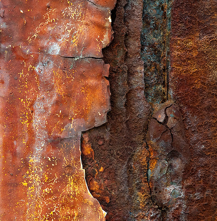
What Went Well: In these set of images, I have attempted to recreate the work of Collin Winterbottom. I took images of gravel and bricks and edited them slightly by adjusting the contrast and colour balance. I think that they work well because some parts of the image are brighter which is more like Winterbottom's work.
Even Better If: These photos could be improved if I actually replicated the textures of the artists work. As you can see, the gravel is he closest I could get to replicating hid work.
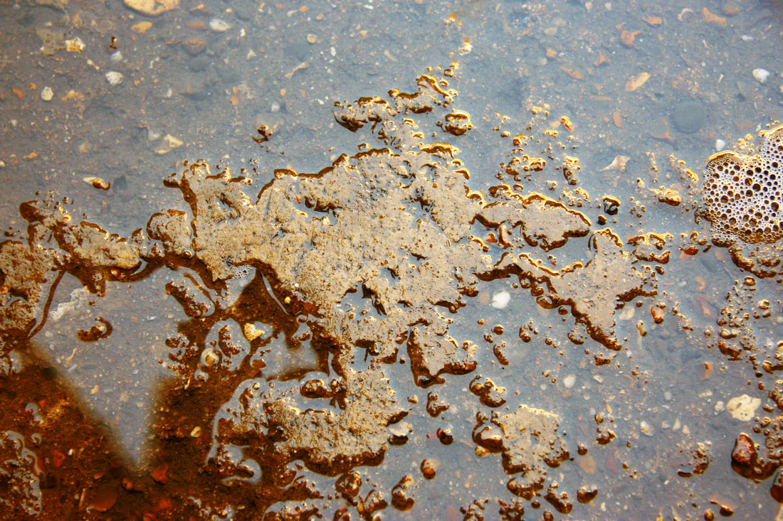
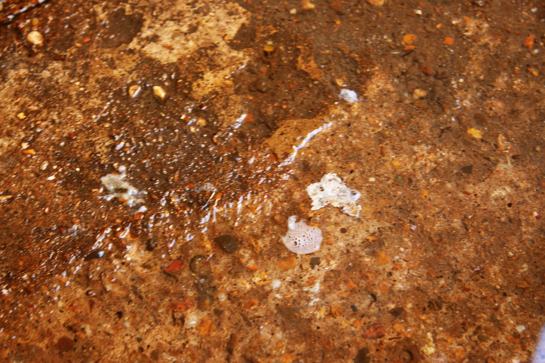
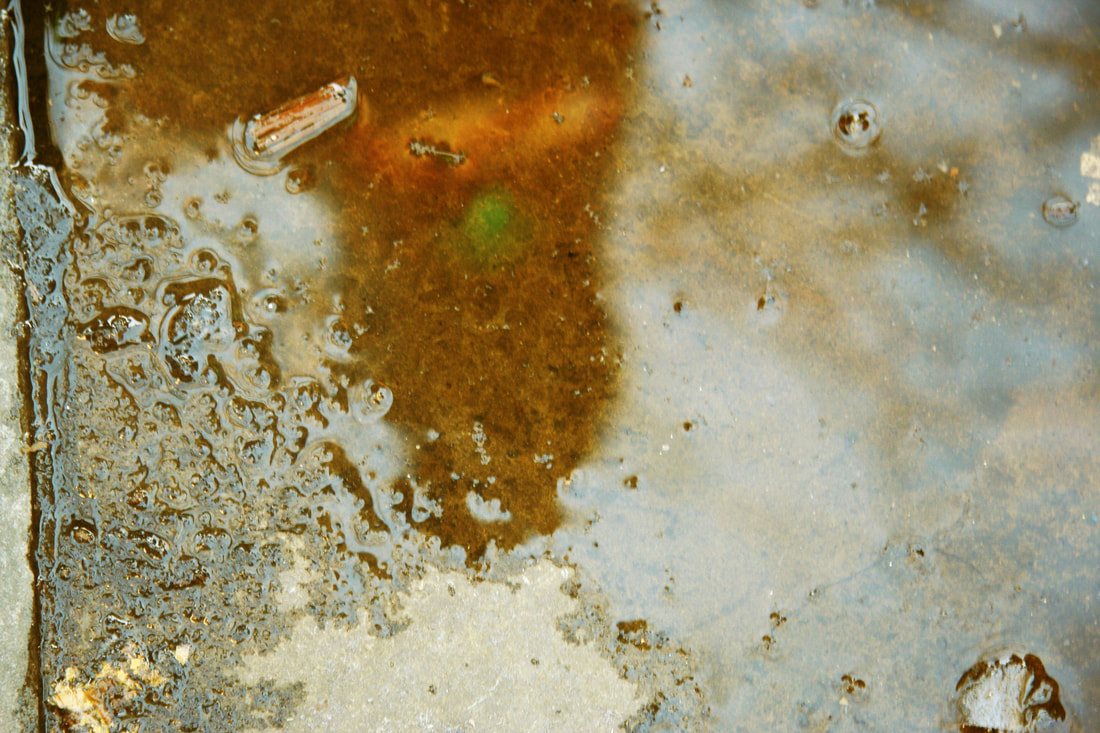
artist vs me
My edit is similar to Winter bottom's work. I have edited my photo in photoshop using the colour balance tool, to create a golden effect on the image. My photo is made from gravel and water.
|
|
Winter bottom's work creates an idea of decay from the gravel that is shown in half of the image. The different contrasts of yellow and gold is something that I should of focused on more because my image only shows 1 tone of yellow, which does not replicate the artists work to it's full potential.
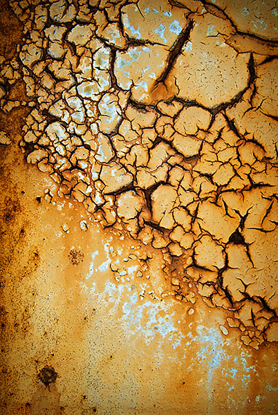
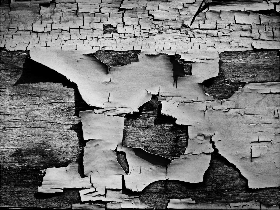
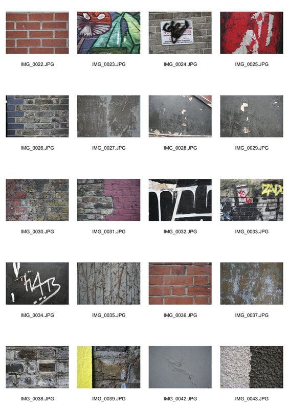
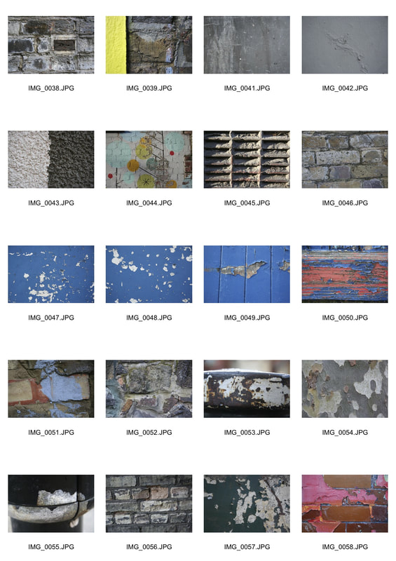
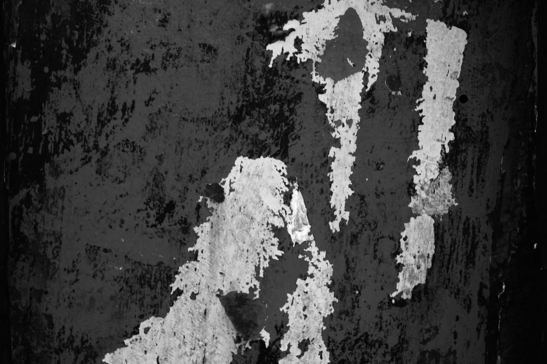
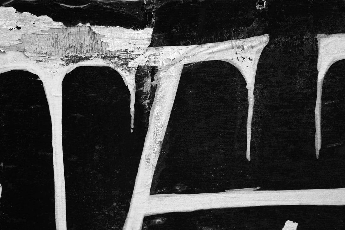
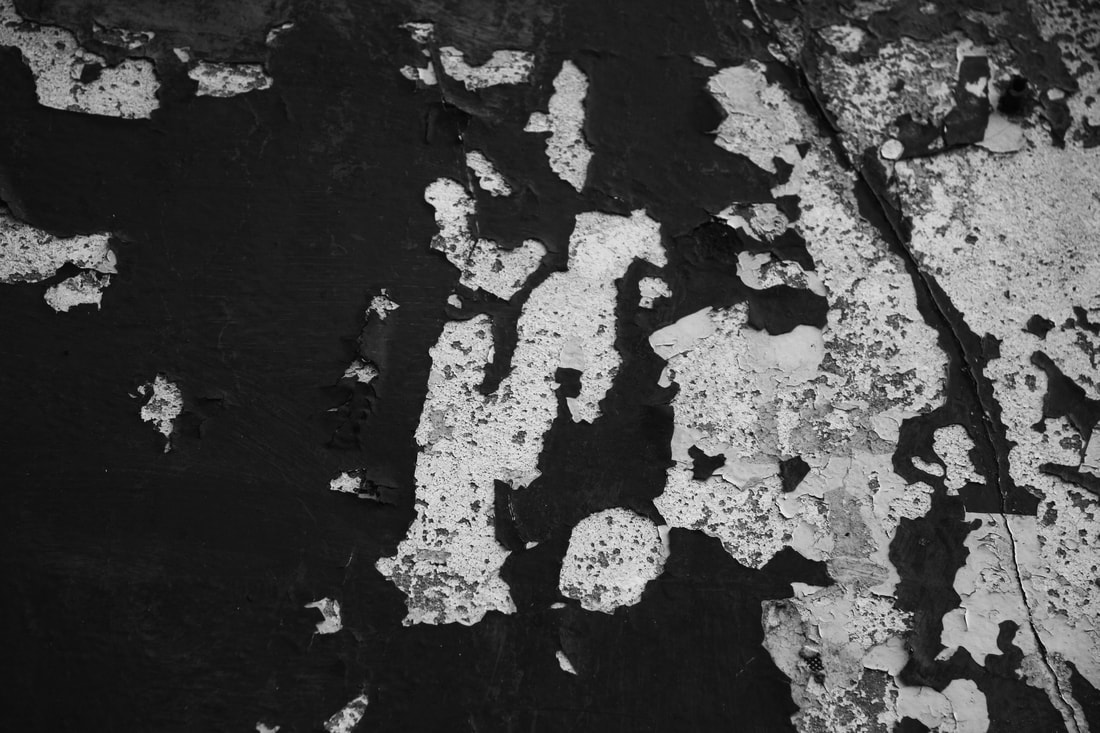
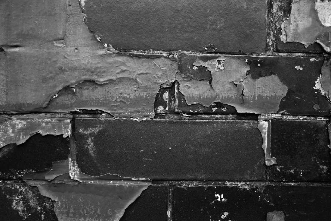
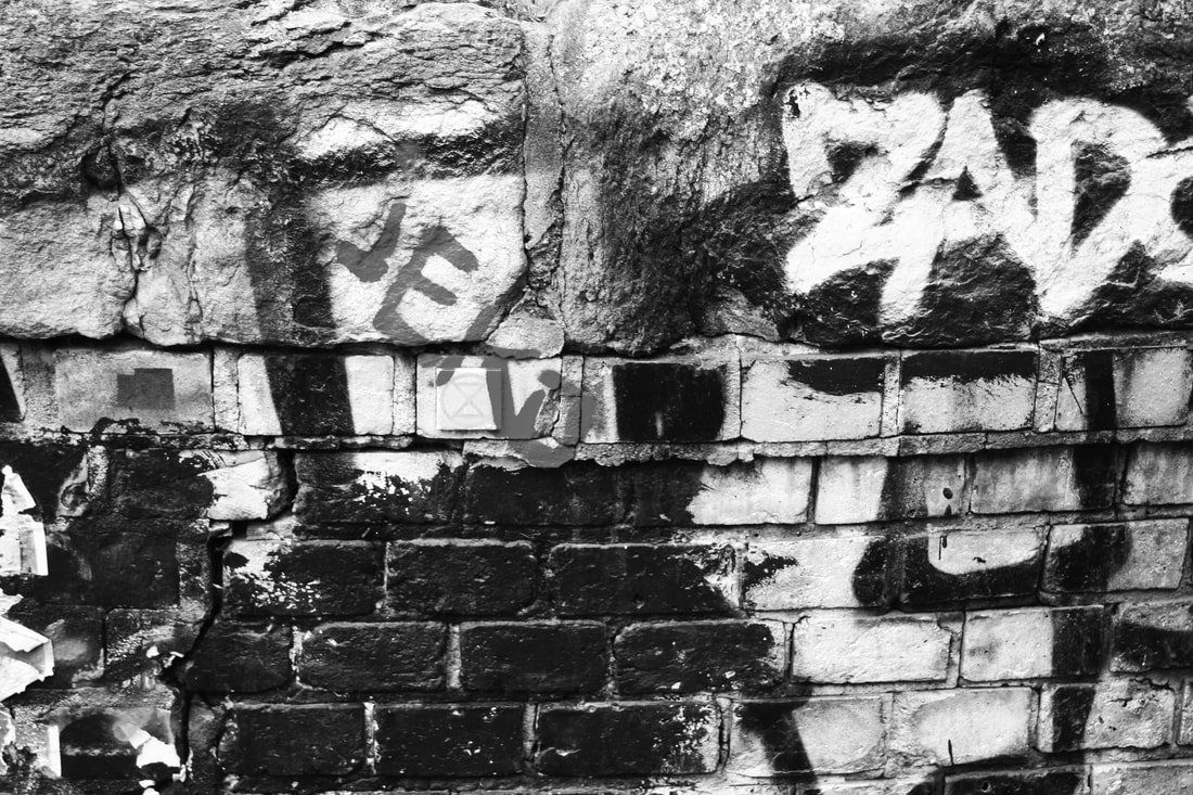
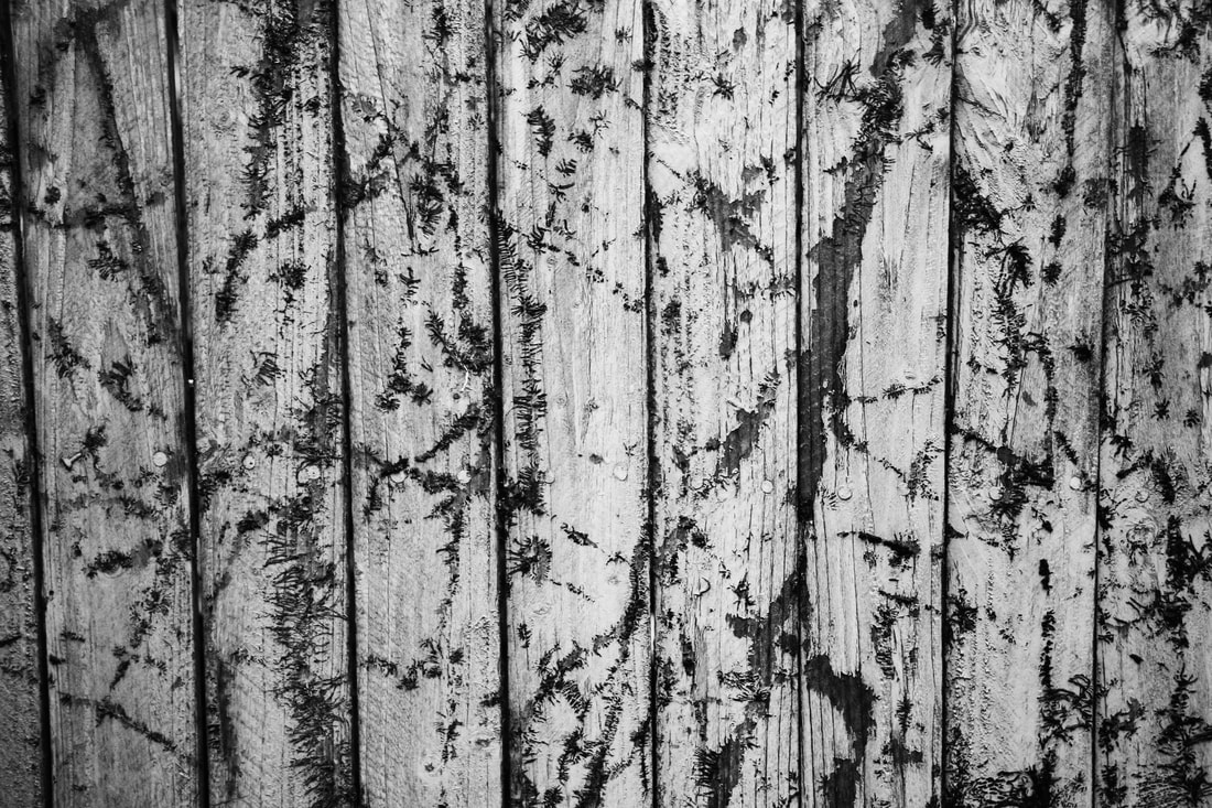
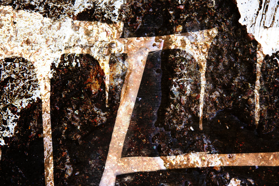
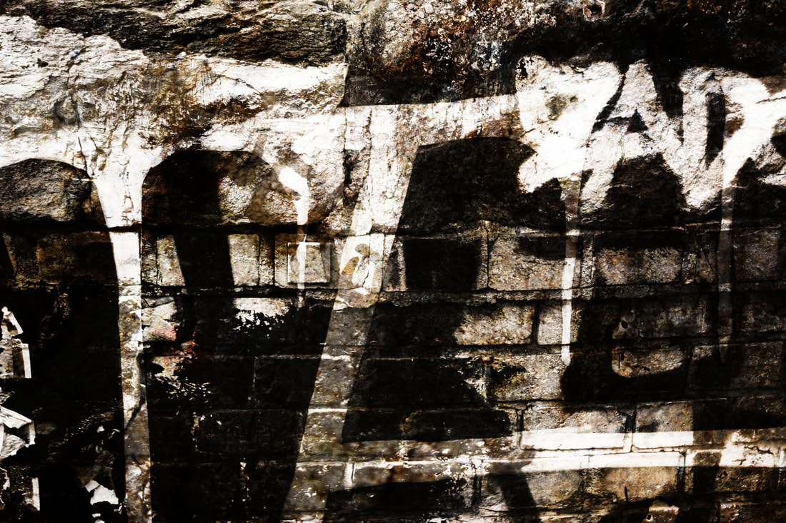
Black and white decaY
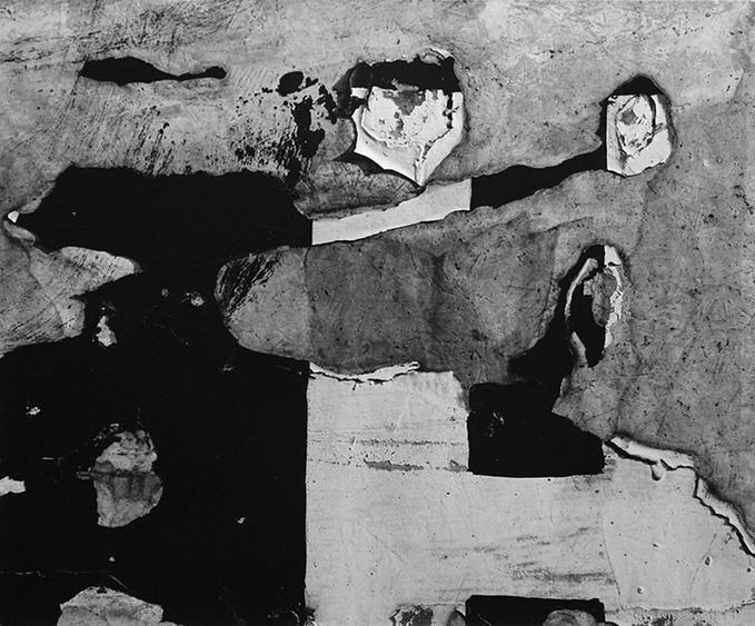
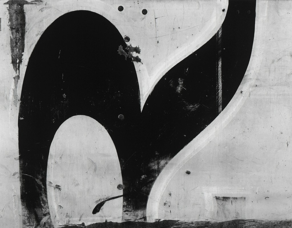
ARTIST ANALYSIS - Aaron siskind
Photographer and educator Aaron Siskind (1903-1991) holds a preeminent place in the history of American photography. Beginning his photographic career in the 1930s as a social documentarian with the New York Photo League, he ultimately radicalized the medium by emphasizing the photograph as an abstract form of expression and an aesthetic end in itself. Siskind taught in New York City's public schools for 25 years before becoming recognized as a photographer and then a gifted pioneer of photographic education. His vision and methods have and will continue to inspire and instruct future generations of artists and teachers.
contact sheets
|
|
edited photographs
|
|
|
|
|
|
What Went Well: In this photo, the contrast of the black and white tones creates a nice negative approach for the the subject of the decay in society. The textures that I found were either graffiti or worn textures.
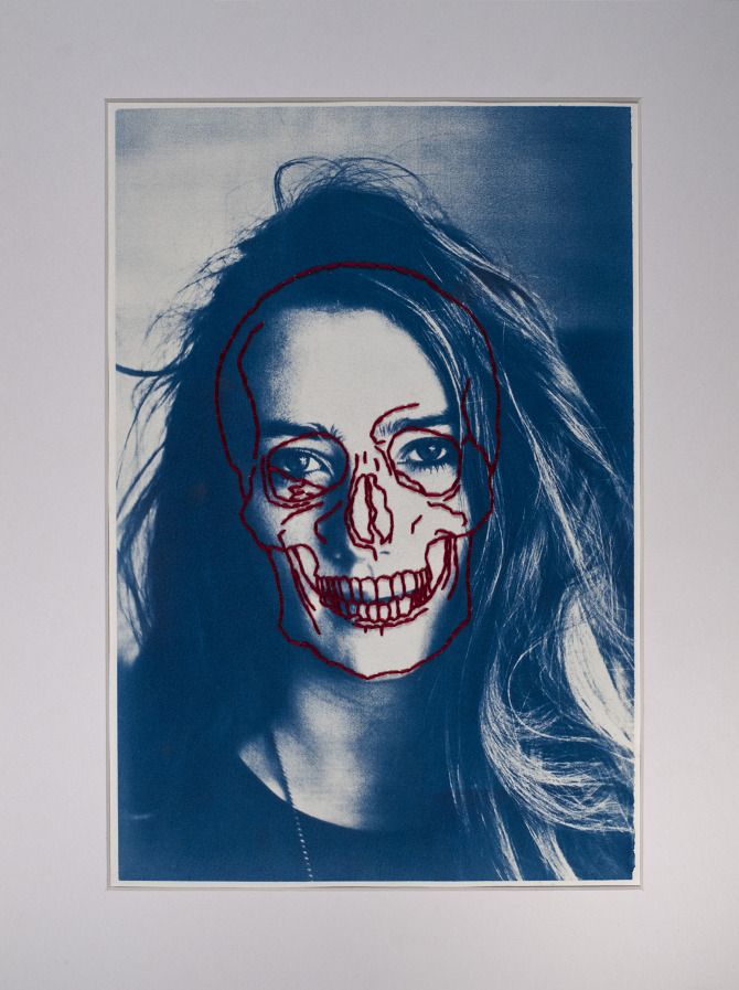
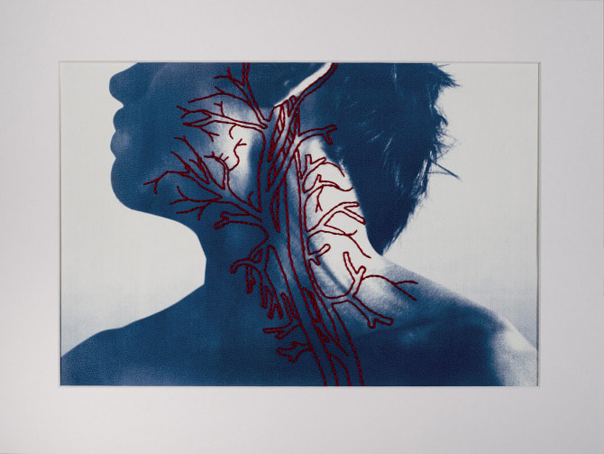
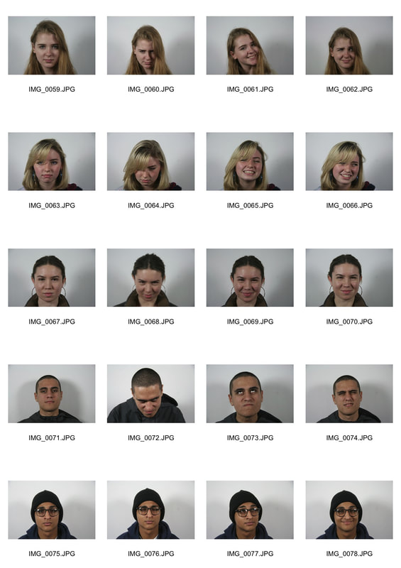
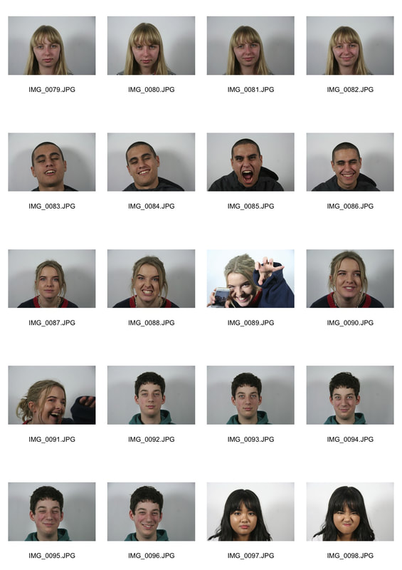
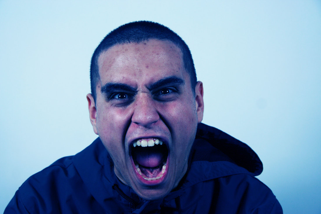
human details
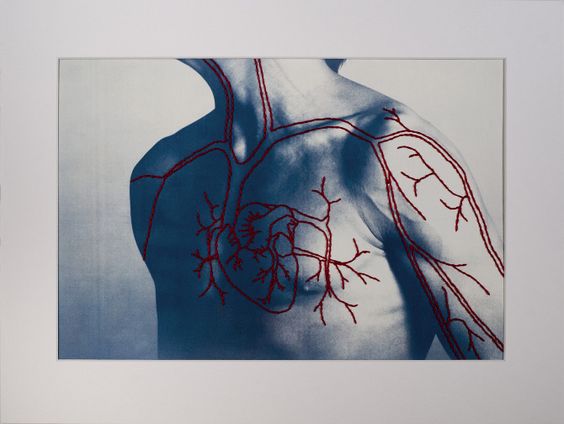
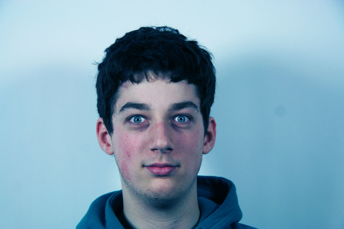
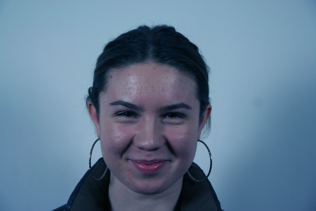
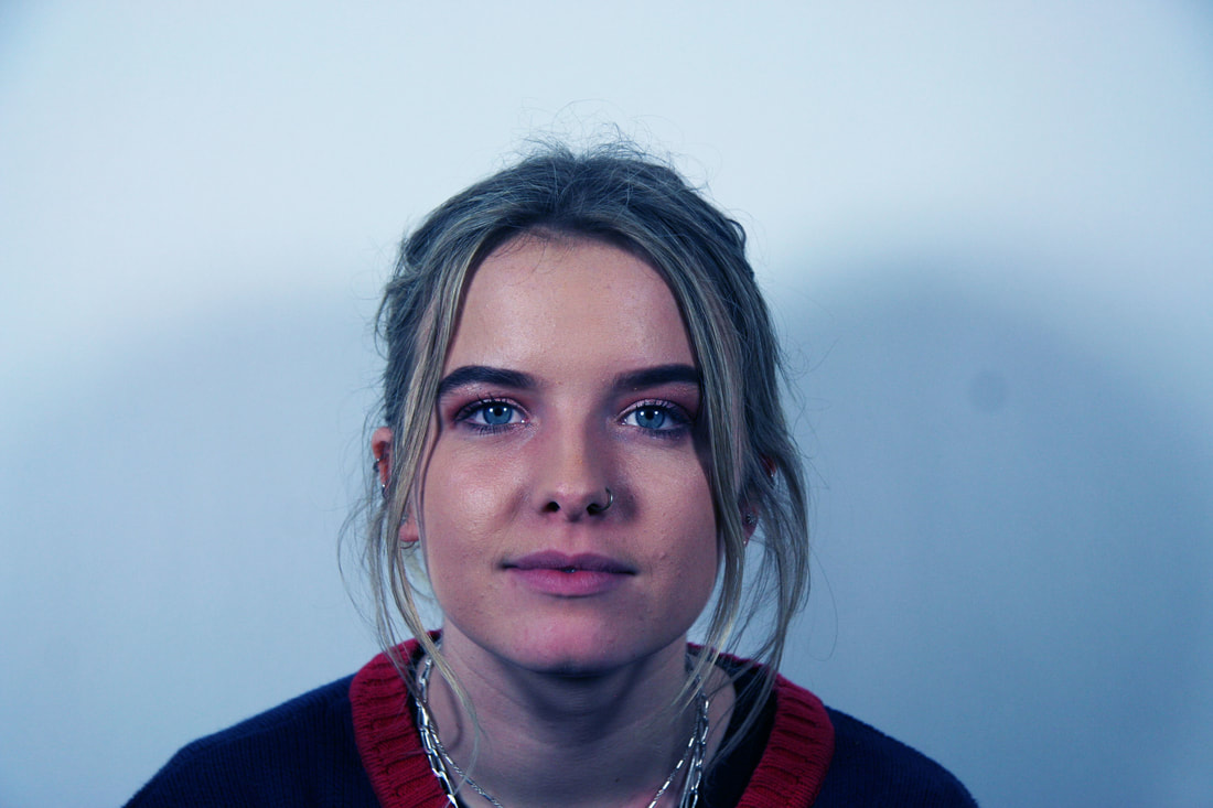
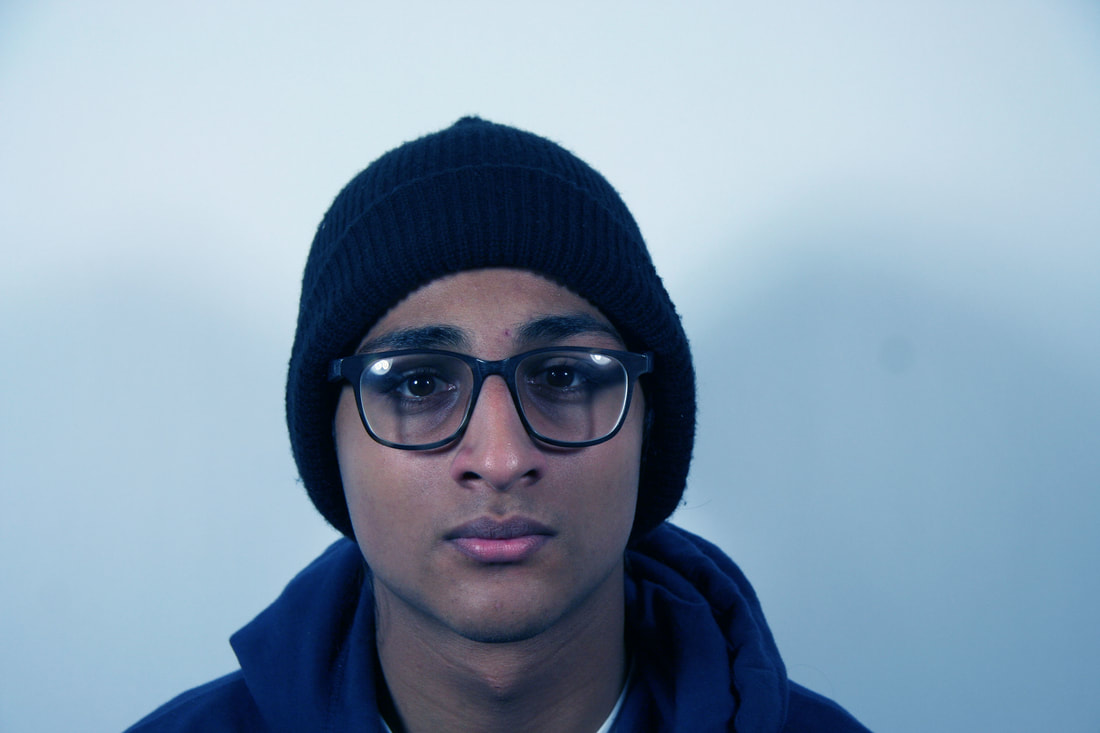
ARTIST ANALYSIS - Peter hickley
In this series of cyanotypes Hickley has intended to outline and emphasise the inner structure of the body on top of the outer structure of the body. He does this by hand stitching red thread on top of his images, here the bold red thread really stands out on top of the faded blue photographs, so that the viewer can clearly see where things line up on the inside of the human body. Also, it can be noted that the stitching is very neat and precise which suggests the photos are quite accurate. Here Hickley wanted us to consider something we don't often, which is the fact that the majority of us never tend to think about what is actually inside of our bodies and the inner structure of them. Normally, images of the body tend to focus on either the outside appearance, or the inside components, rarely both. Consequently, Hickley's aim is to present us with a combination that displays all parts of the human body to make us see both at one time.
contact sheets
|
|
edits

|
|
|
What Went Well: *the range of emotions displayed by each individual, as it gave me more diverse photos to work with when it came to further editing. The blue tones of the photo helped connect my work to that of Peter Hickley.
Even Better If: This could be improved if I photographed more details of the face, instead of capturing the portrait image of them. Also, Hickley used lines to represent the lines on their face.
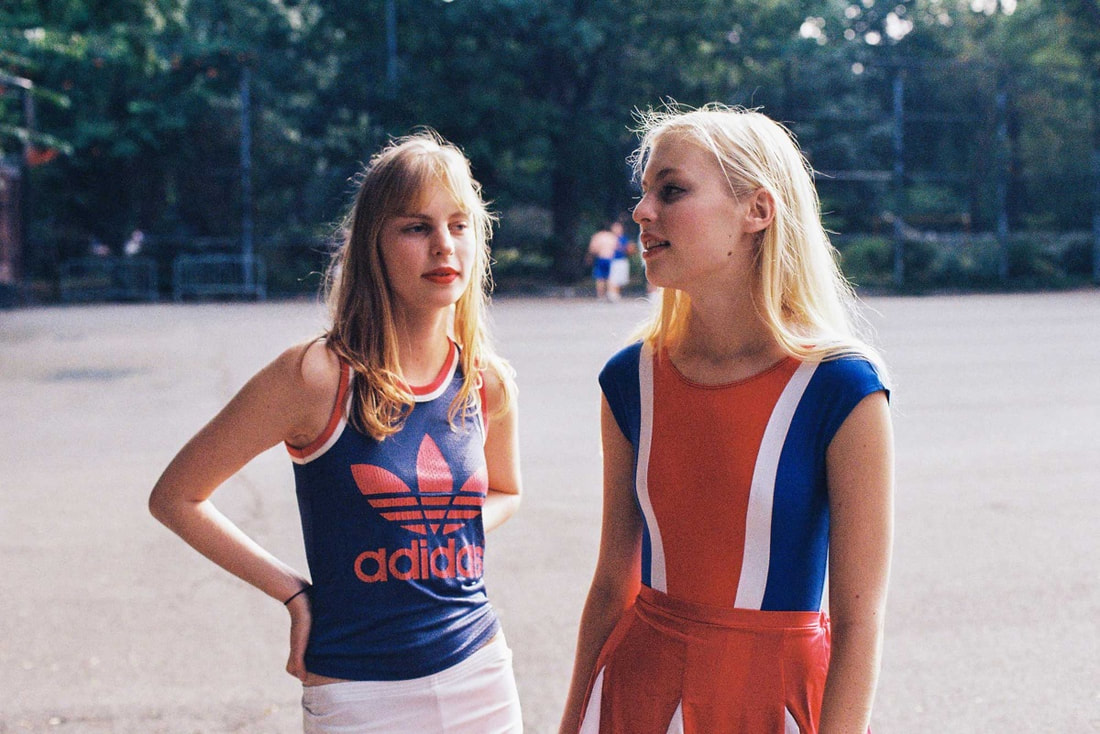
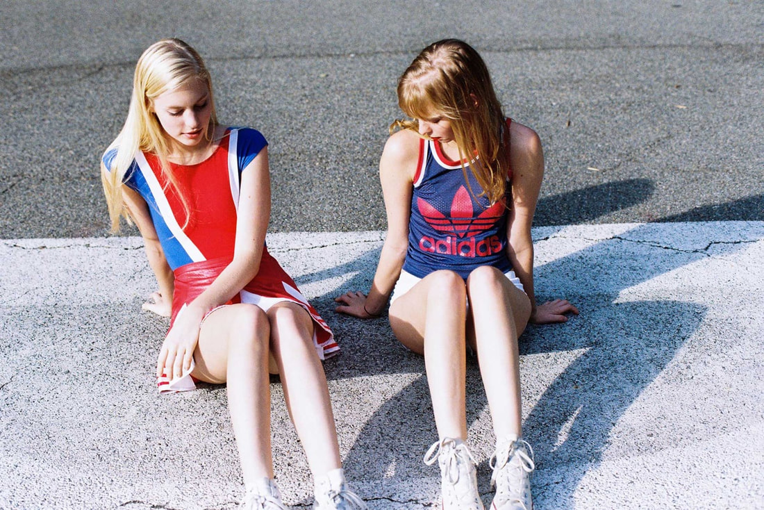
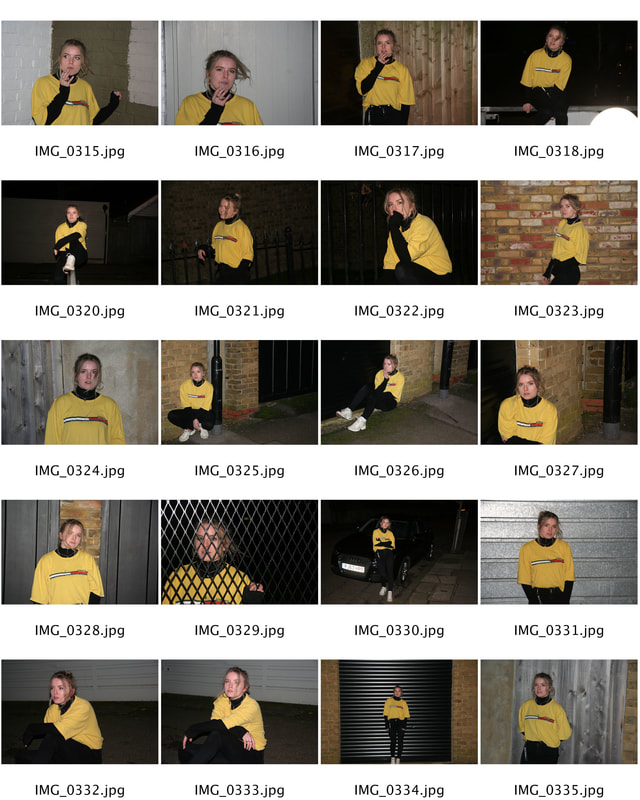
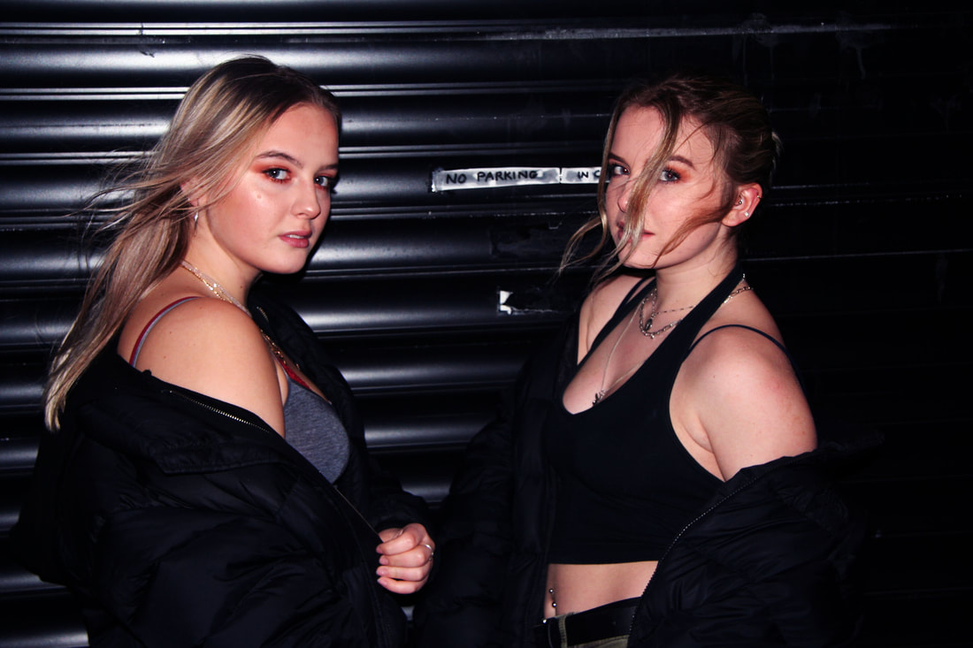
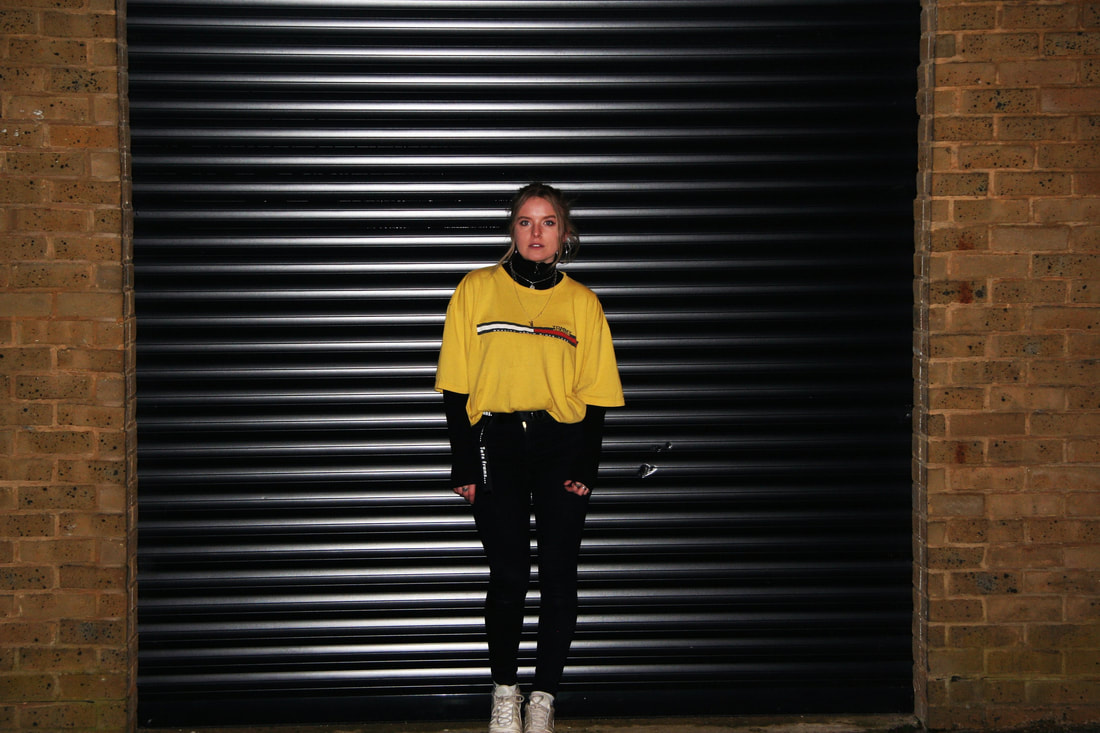
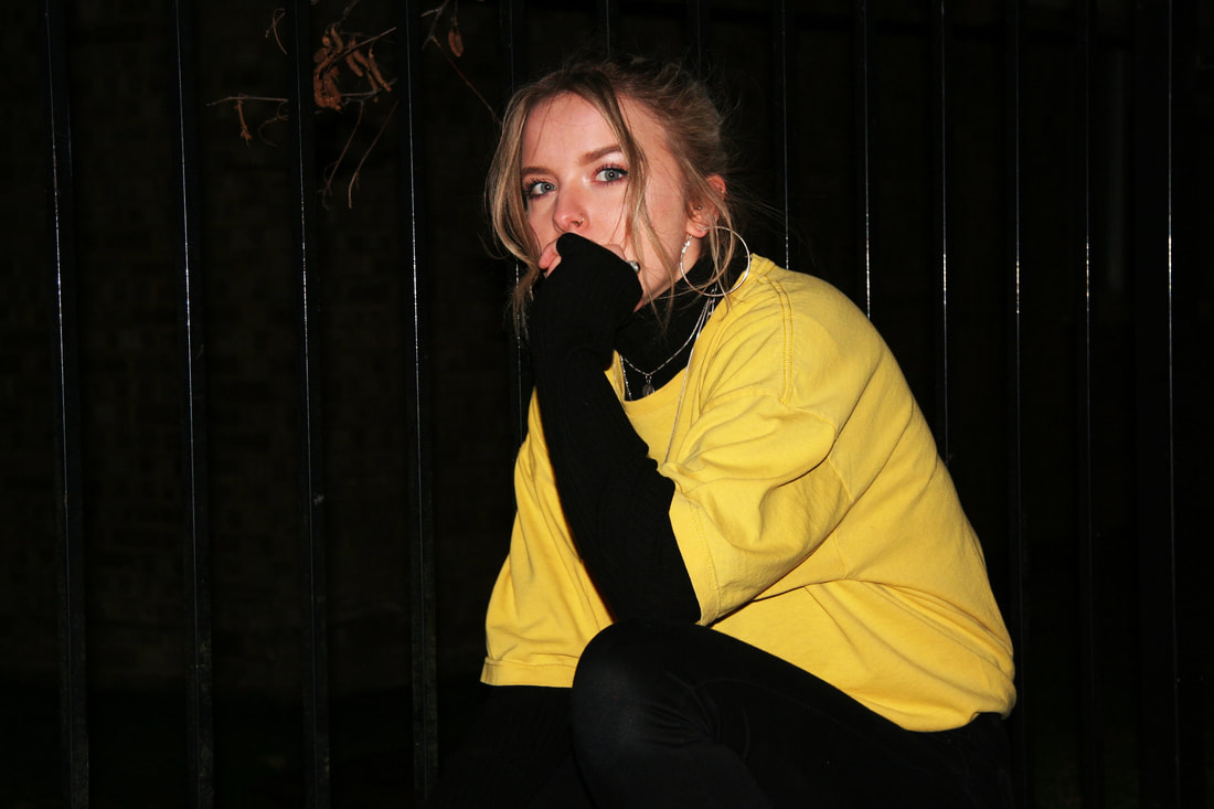
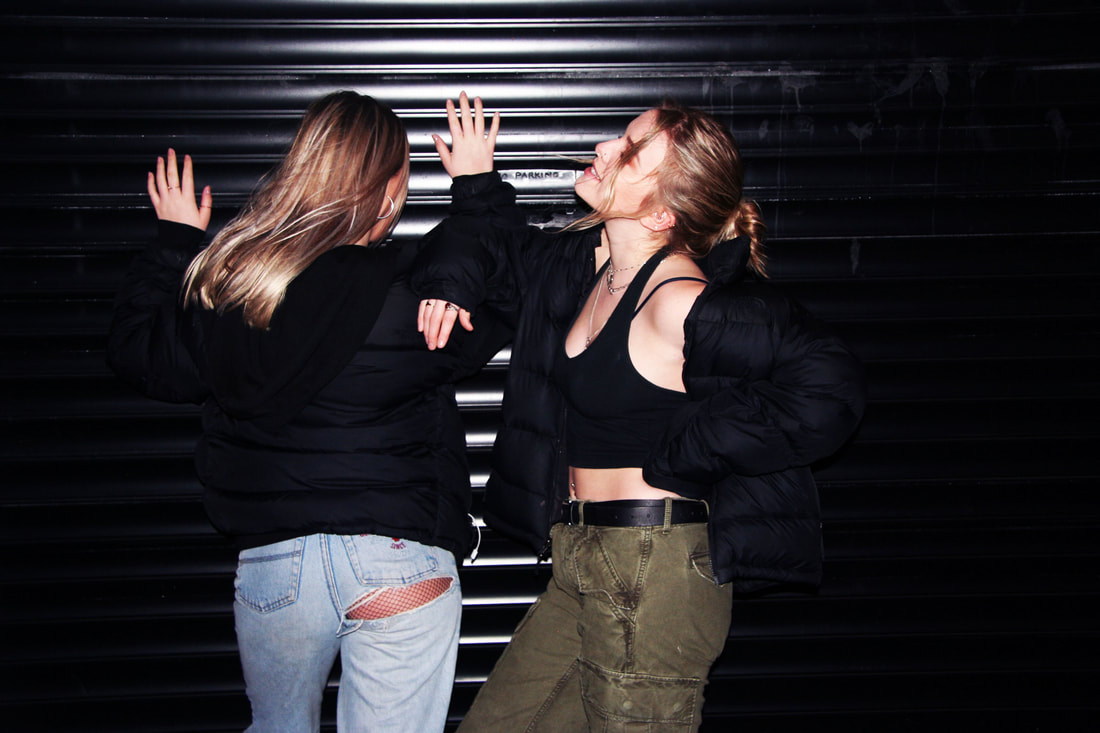
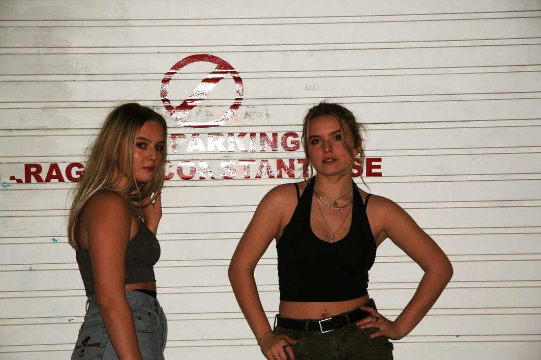
youth in society
ARTIST ANALYSIS - Wiissa
Wiissa is a par of photographers (Vanessa Hollander & Wilson Philippe) that capture the beauty of the youth today. Their images relate to the theme of Structure as my idea for my final piece is going to be about the decay in society, so young people can link well to this. The main variety of her images are taken i the sun, signifying positivity and good health. This is a contrast to my idea, however, I think that If i can include a contrast, the photographs will look more detailed and more meaning behind them.
contact sheets
|
|
edits
|
|
|
What Went Well: The photos above worked in a way that my models posed to create an idea of young people and their attitudes in society today.
Even Better If: These photos could of been improved if I shot them in the day rather than the night. This would mean if I could of replicated their work to a full potential.
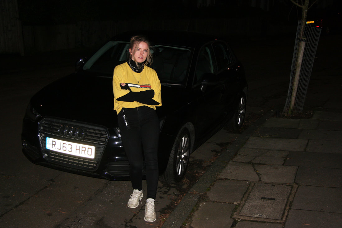
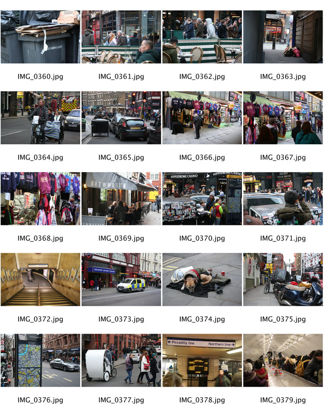
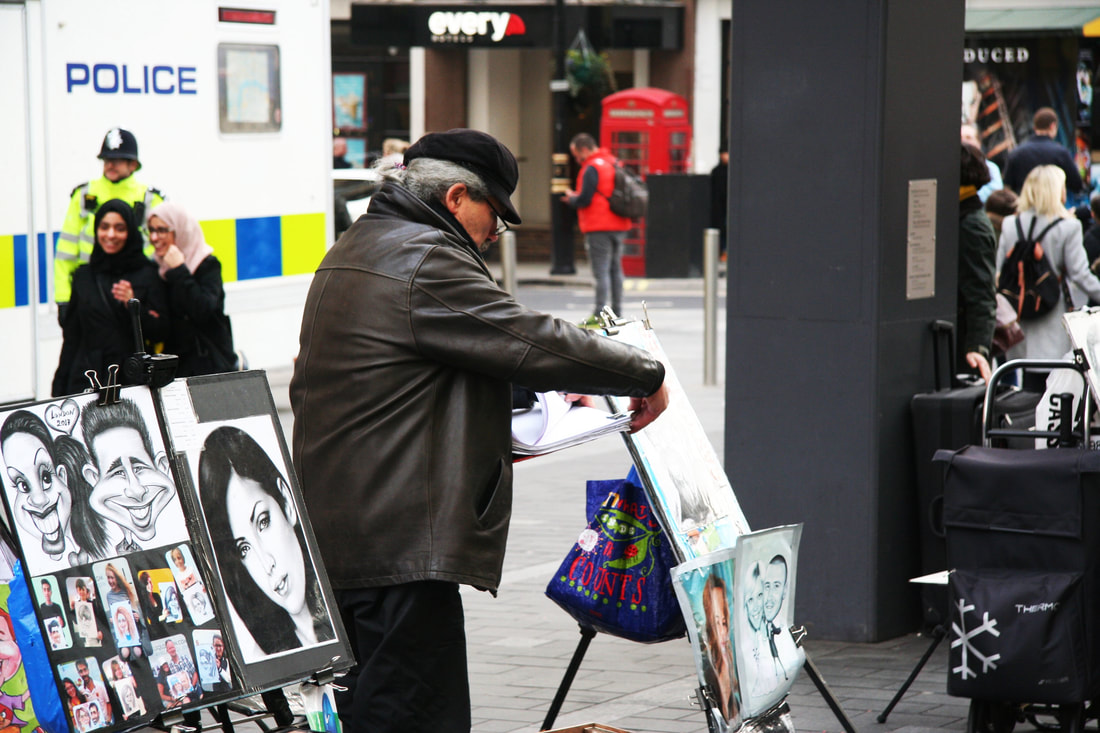
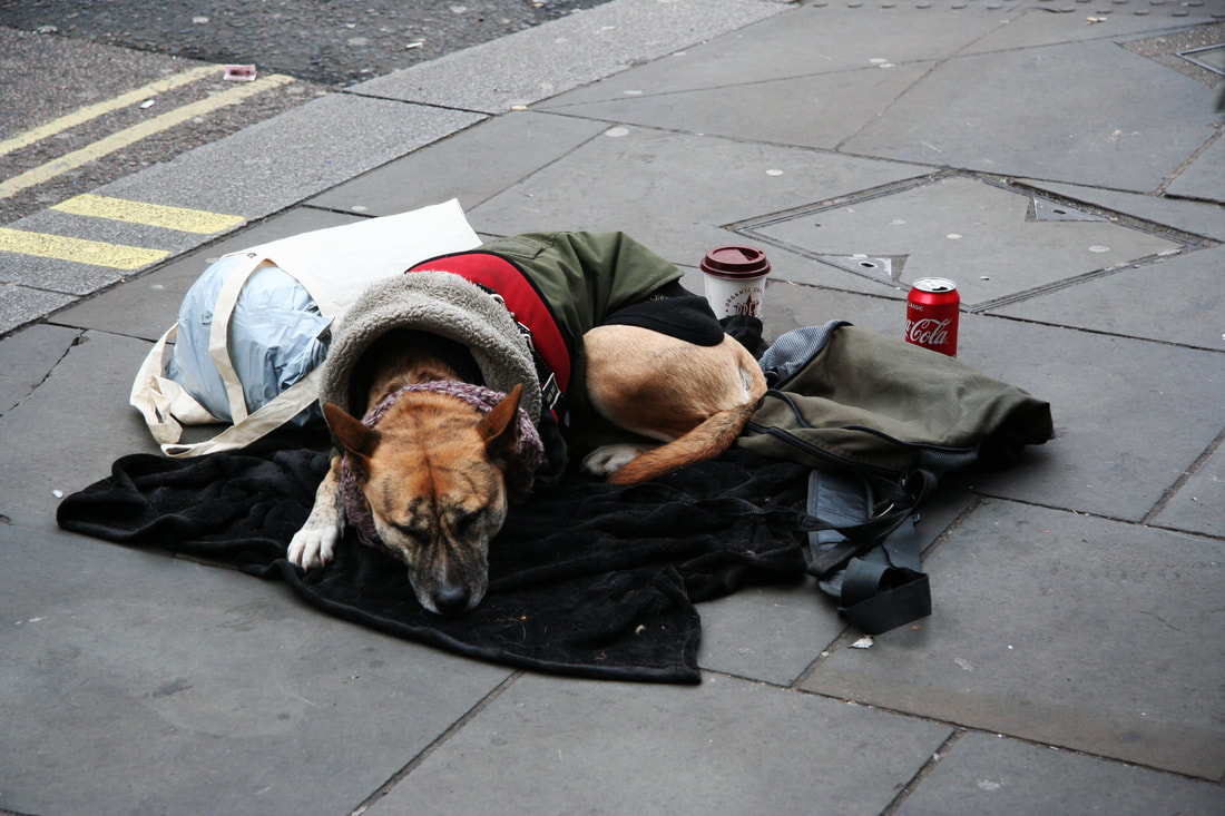
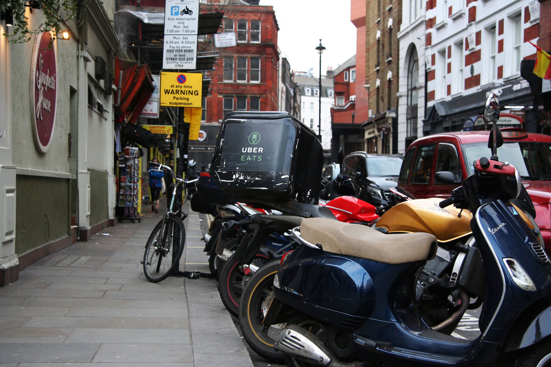
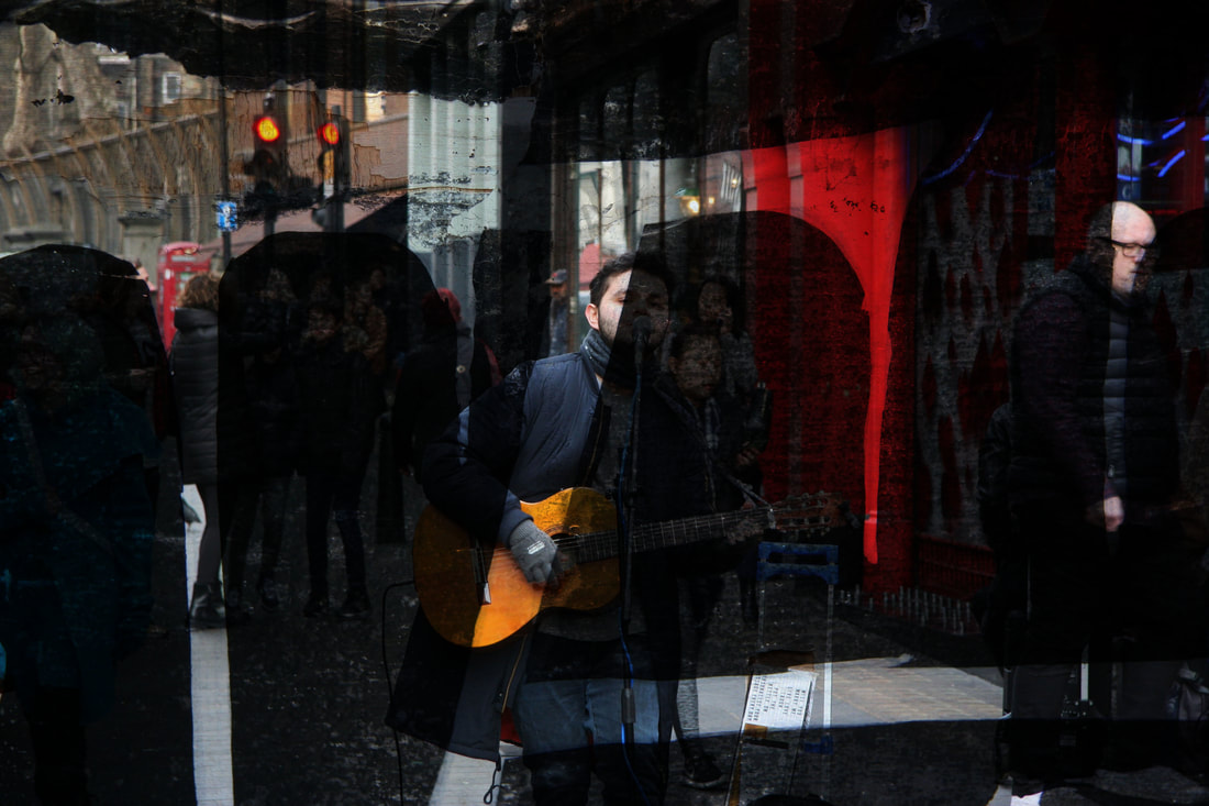
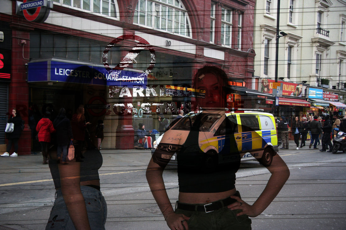
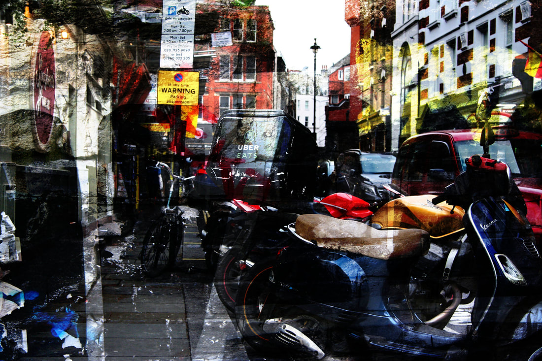
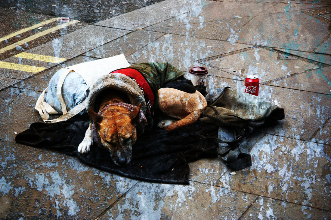
London culture
contact sheets
|
|
edited photographs
|

|
|
What Went Well: i managed to capture the diverisity in London through my photographs, as i tried to show the differences in people around london.
Even Better If: I explored different parts of london such as places more upper class or more run down, it would be better if i didnt just focus on the main areas of london and tried to capture the extreme upper and lower classes of london.
development
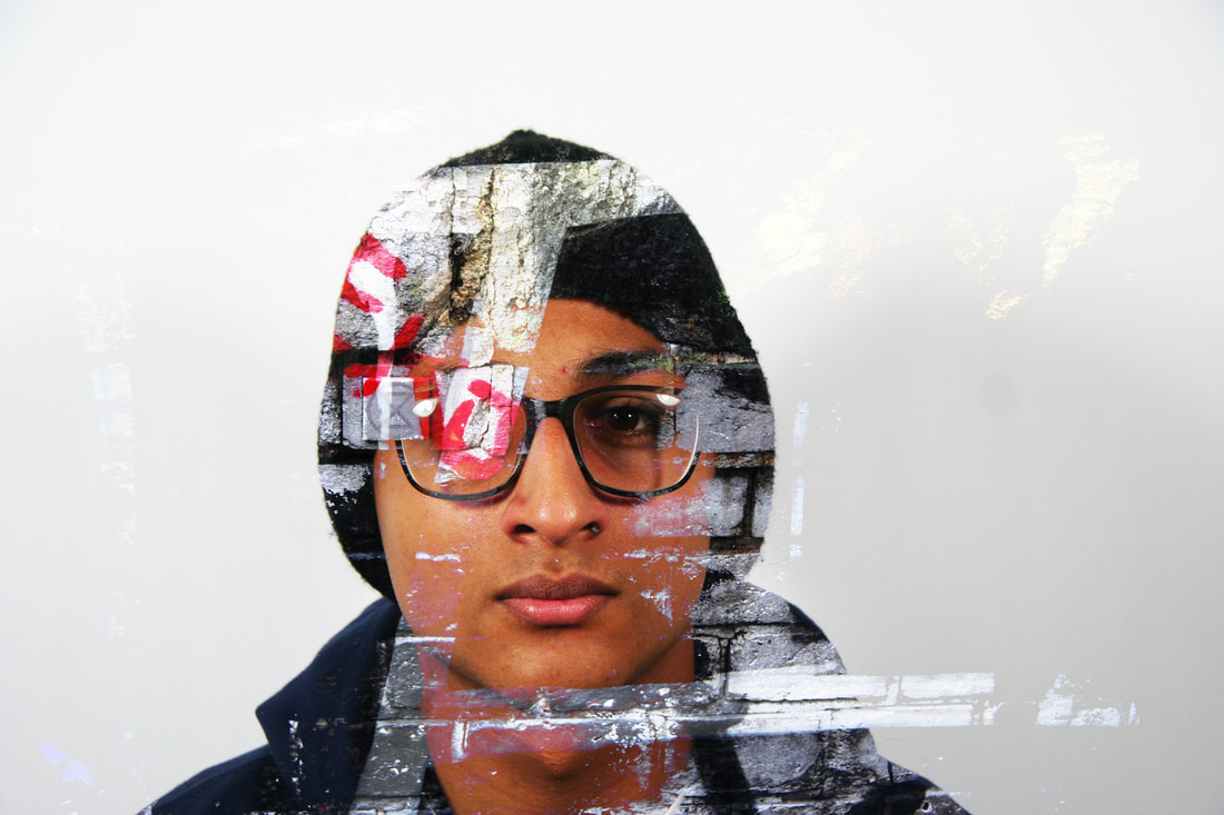
This is my development. I have finished creating all ideas that I am using for my development and I have chosen to chose specific sets to expose with other sets. In my developments, I have chosen to use the ideas for the golden decay, inspired by Collin Winterbottom, The Grayscale and colour decay, inspired by Aaron Siskind, Human Details inspired by Peter Hickley and London Culture. My next step is to experiment with the different double exposures to see which ideas fit together to convey a clear response to decay in society.
First development
This is my first development. I have decided to double expose the idea of young people from the studio, to focus on the human details with the black and white and colour textures in society. I think that this idea works well as it shows a way of showing the decay of people in society. This is my first development so I am planning to experiment with other young people further in my project.
Above are the steps that I used to create the majority of the photos in this development. Firstly, I added the two photos that merge to convey ideas about decay in society. Next, I copy and paste them onto each other, creating multiple layers onto one document. Finally, I dragged the texture photograph on top of the girl. Then, I overlaid the photo on top with the background image, creating a double exposure.
Edited photographs
|
|
|
|
|
|
What Went Well: The subject I chose to photograph was urban textures along with young people, shot in the studio. I managed to expose very well. As you can see, I have double exposed the two different subject matters into one photograph. I prioritised the aperture to manipulate depth of field.
Even Better If: This was my first idea. I could improve this a lot and expand my skills to create more meaningful images. The photos above are exposed with one simple step. I have copied and pasted two images together. My next development is going to be similar, however, the photographed concepts are going to be linked to the decay in society.
second development
This is my second development, I have chosen to double expose textures with my photographs from London culture, also I have included young people with the London culture. I think that the idea of the textures and London culture does not show the decay in society well enough, therefore, I will attempt in my future developments to show the idea of my project more clearly. On the other hand, I do think that the young people exposed with photographs from London works as it emphasises the idea of people and there attitudes towards London and its culture.
Above are the steps that I used to create the majority of the photos in this development. Firstly, I added the two photos that merge to convey ideas about decay in society. Next, I copy and paste them onto each other, creating multiple layers onto one document. Finally, I dragged one of the photographs on top of the other. Then, I overlaid the photo on top with the background image, creating a double exposure.
EDITED PHOTOGRAPHS
|
|
|
|
|
|
|
|
|
What Went Well: The subject that I chose to photograph was the double exposure of young people, shot in urban areas, and the London Culture. My composition helped to support my response to the theme by creating a hard light exposure on my photographs, making them dark and contrasted.
Even Better If: I made the two layers of photos more clear and defined so it was easier to distinguish between each photo used in my edits. I could have achieved this by changing some of the colours in the images or moved the more vivid colours away from facial features. Tj
THIRD DEVELOPMENT
This was my third development. I chose to photograph close up on the human face and double expose the textures with them. This was a development from my last one as my last development included photographs on the streets. Personally, the close up shots reflect better with the subject of the theme which is Structure as my photos below show structure through the shapes and angles on the face and the textures also.
Above, were the steps I used to create the photos. Firstly, I opened a texture photo and a close up on my friend. Copying one on top of the other meant that now they were in the same document but two different layers. After this, I choose darken the layer on top which meant both are visible in a darkened effect.
EDITED PHOTOGRAPHS
What Went Well: The subject I chose to photograph was textures along with close up human faces. I managed to expose very well. As you can see, I have double exposed the two different subject matters into one photograph. I prioritised the aperture to manipulate my depth of field.
Even Better If: This was my third idea. I could improve this a lot and expand my skills to create more meaningful images. The photos above are exposed with one simple step. I have copied and pasted two images together. My next development is going to be similar, however, the photographed concepts are going to be linked to the decay in society.
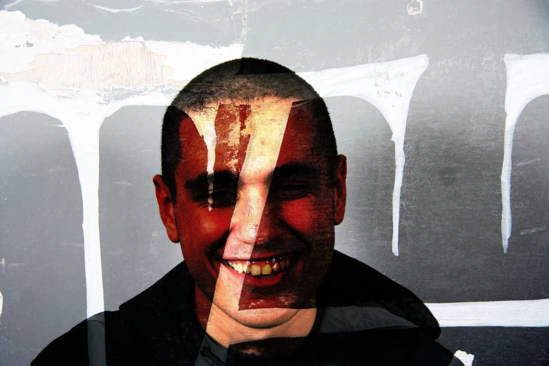
fourth development
This is my third development. I have decided to double expose the idea of young people with the golden decay. I think that this idea works very well with the specific textures combing well with the photographs I have taken. Also, in terms of the meaning of the idea, the concept of golden decay and young people contrasts to the idea in a way that connects it together. The presents of dirt and gravel blending in shows decay however the golden effect, inspired by Collin Winterbottom, connotates richness and wealth. So overall, both aspects of the idea that I have present connected with different youths in society today, but in different ways.
Above are the steps that I used to create the majority of the photos in this development. Firstly, I added the two photos that merge to convey ideas about decay in society. Next, I copy and paste them onto each other, creating multiple layers onto one document. Finally, I dragged the texture photograph on top of the girls. Then, I overlaid the photo on top with the background image, creating a double exposure.
Above are the steps that I used to create the majority of the photos in this development. Firstly, I added the two photos that merge to convey ideas about decay in society. Next, I copy and paste them onto each other, creating multiple layers onto one document. Finally, I dragged the texture photograph on top of the girls. Then, I overlaid the photo on top with the background image, creating a double exposure.
EDITED PHOTOGRAPHs
|
|
|
|
|
|
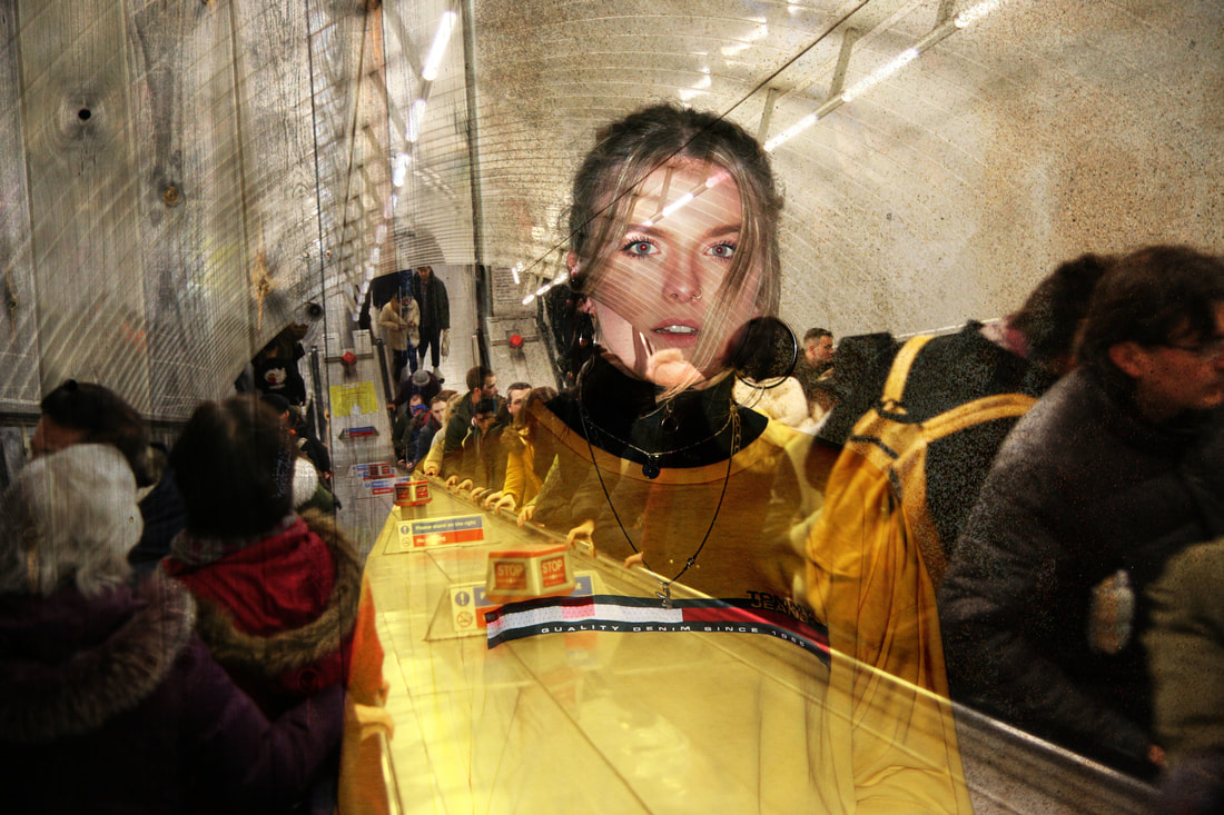
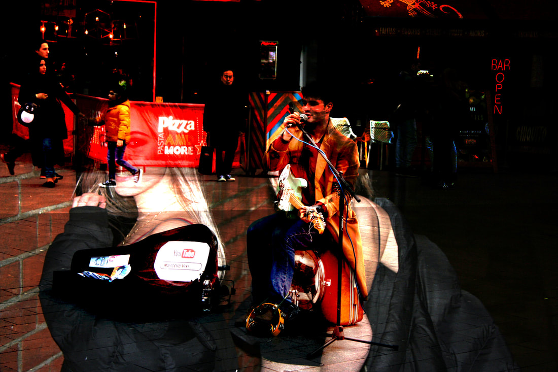
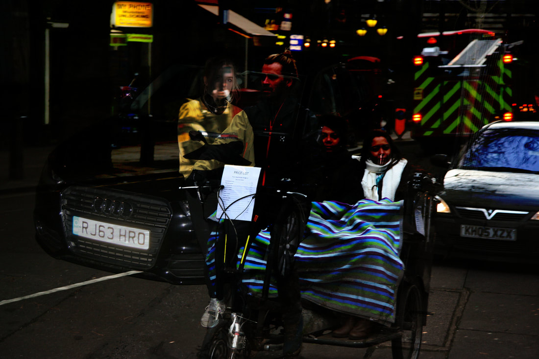
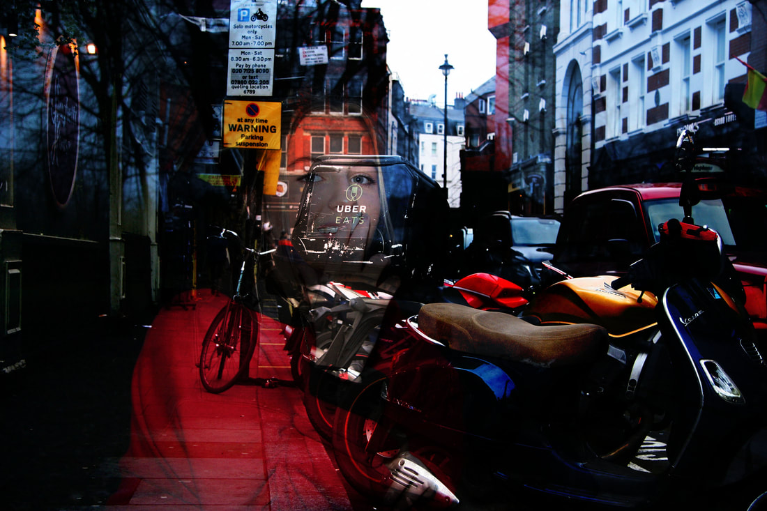
I wanted to show the decay of society through layering 'young' people over decaying scenes of the environment such as rusting and cracks of paint. The aim of these photographs was to show how the physical decay in societies environment correlates to the decay we see in the younger social groups of society .
What Went Well: The subject that I chose to photograph was Young people in urban areas and Textures. I managed to expose these images very well to show the young people and the textures that are shown within the people. When taking the shots for the young people, I used my tripod to avoid the camera shake and capture the best possible image.
Even Better If: To make this bteer i should of taken more care over what i layed over eachother as in some images its unclear what the two layers are, lots of the textures and secondary images are hard to establish when layed onto the persons in the frames.
fifth development
My fourth development shows an overall development of my work through the project. I have decided to take things further by triple exposing young people and textures together with more than two images. I think that this creates an interesting approach as it shows many different views on the decay in society. However, some of the edits I have made are too contrasted and have too many photographs in them, making them look overwhelming to the audience. So as a development, I am going to subtract images from my edits so that the idea of the decay in society is more clear.
Above are the steps that I used to create the majority of the photos in this development. Firstly, I added the two photos that merge to convey ideas about decay in society. Next, I copy and paste them onto each other, creating multiple layers onto one document. Finally, I dragged one of the photographs on top of the other. Then, I overlaid the photo on top with the background image, creating a triple or even four way exposure.
Above are the steps that I used to create the majority of the photos in this development. Firstly, I added the two photos that merge to convey ideas about decay in society. Next, I copy and paste them onto each other, creating multiple layers onto one document. Finally, I dragged one of the photographs on top of the other. Then, I overlaid the photo on top with the background image, creating a triple or even four way exposure.
EDITED PHOTOGRAPHs
What Went Well: The subject of this image was to expose multiple textures and young people together. I think that this went well because each layer shows a different meaning of decay in society. I also used a tripod to avoid camera shake.
Even Better If: To make this better i should of taken more care over what i layed over each other as in some images its unclear what the two layers are, lots of the textures and secondary images are hard to establish when layed onto the persons in the frames.
sixth development
This is my fifth development. Since my last improvement, I have excluded multiple images from the photos I took. This makes it more clear to focus on one subject of the image. Below are the images that I edited. I have experimented by overlaying textures onto the models, which is then pasted onto a background texture. I think that this makes the decay of society more clear, rather than having two or more people in the same photo, on top of multiple textures.
Above are the steps that I used to create the majority of the photos in this development. Firstly, I added the three photos that merge to convey ideas about decay in society. Next, I copy and pasted the texture I wanted to merge into the person. This created a pattern that I double exposed into the area where she is shown on the image. After creating that layer, I copy and pasted it onto the final texture layer that I used on the background. This meant I had to select it and erase any of the excess image that was on the paste when I added it to the background layer. After erasing that, the final image was made, with two different textures shown, one in the background and one in the model that I used for this image.
Above are the steps that I used to create the majority of the photos in this development. Firstly, I added the three photos that merge to convey ideas about decay in society. Next, I copy and pasted the texture I wanted to merge into the person. This created a pattern that I double exposed into the area where she is shown on the image. After creating that layer, I copy and pasted it onto the final texture layer that I used on the background. This meant I had to select it and erase any of the excess image that was on the paste when I added it to the background layer. After erasing that, the final image was made, with two different textures shown, one in the background and one in the model that I used for this image.
Edited photographs
This is the end of my development and I have decided to make my final piece with the idea of my fifth development, using young people and multiple textures to convey the decay in society in the best way possible. I will use new photos for my final piece, however, I will be considering the same idea of close up images of the face and also full body shots in urban areas.
Final Pieces
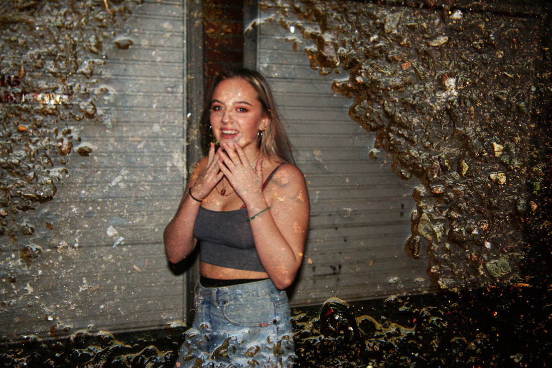
My intentions in these photographs and gifs were to show decay in society. I used teenager's to show this generation of society and took photographs in urban areas, to show decay I captured run down areas as well as graffiti, I also wanted to capture visible decay of buildings, such as rust and rotting.
|
|
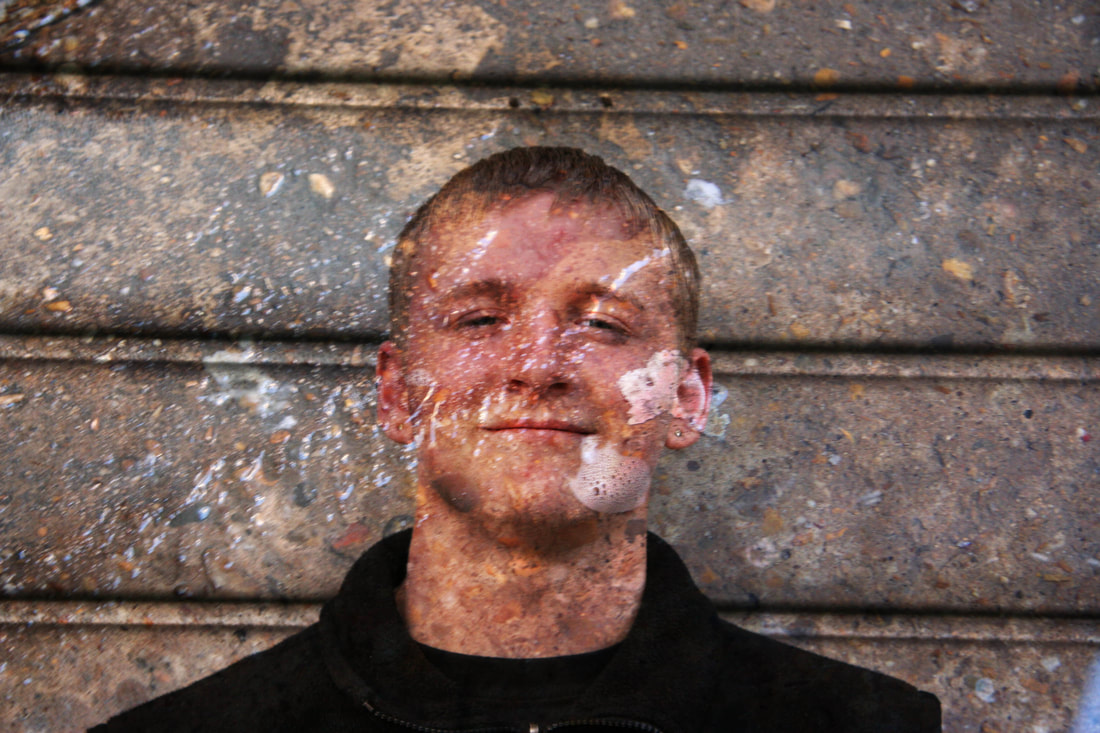
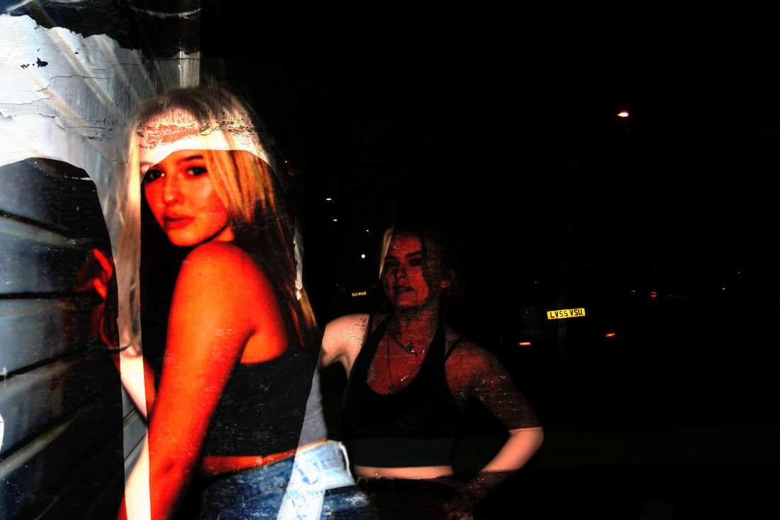
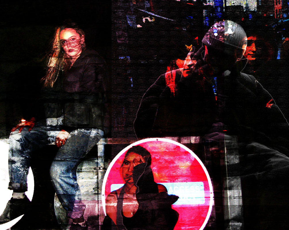
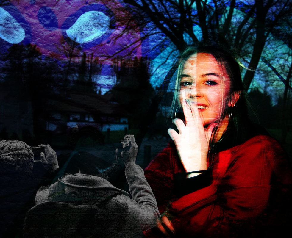
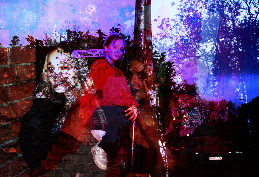
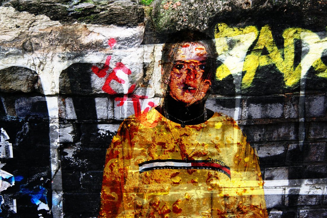
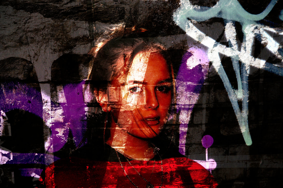
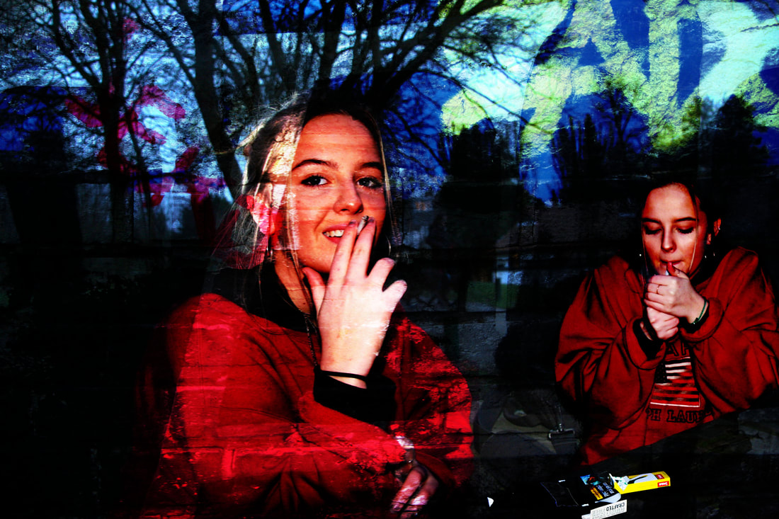
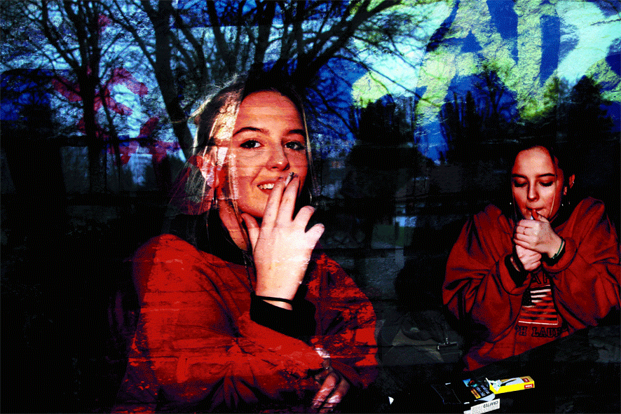
This is one of my final pieces. In this piece, I have presented the still image and the gif together. I think that the triple exposure in the image with the texture and the model. The exposure on the sky and the graffiti really emphasise the meaning before the decay in society by contrasting the urban vandalism and the natural sky. In terms of the emotions on my models face, the happy vision and the smoking actions in the image convey the lifestyle of young people in society today.

|
|
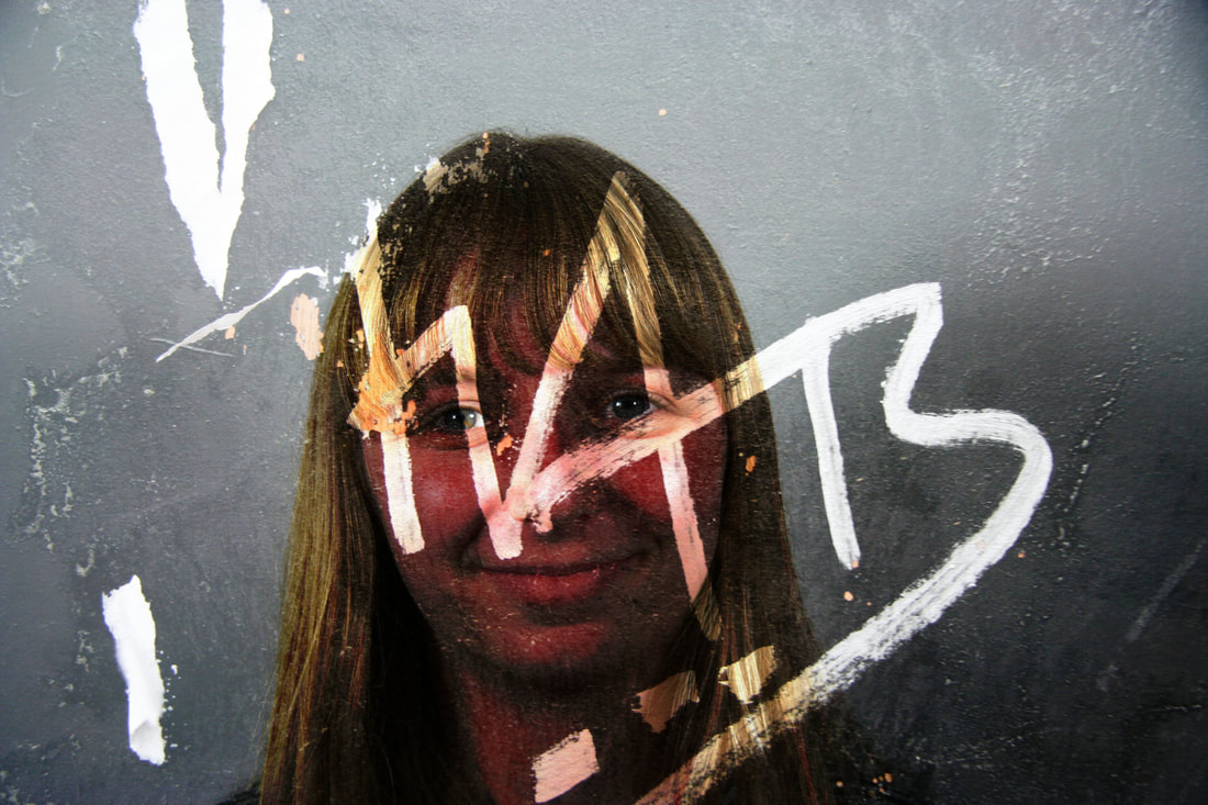
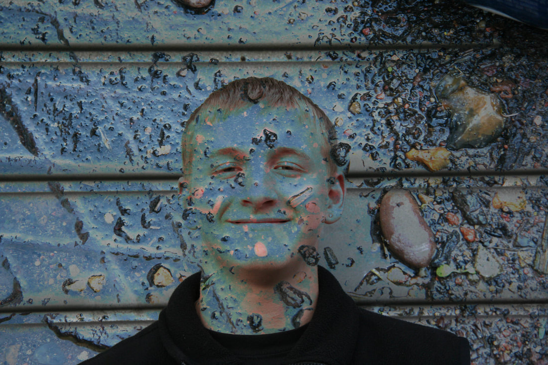
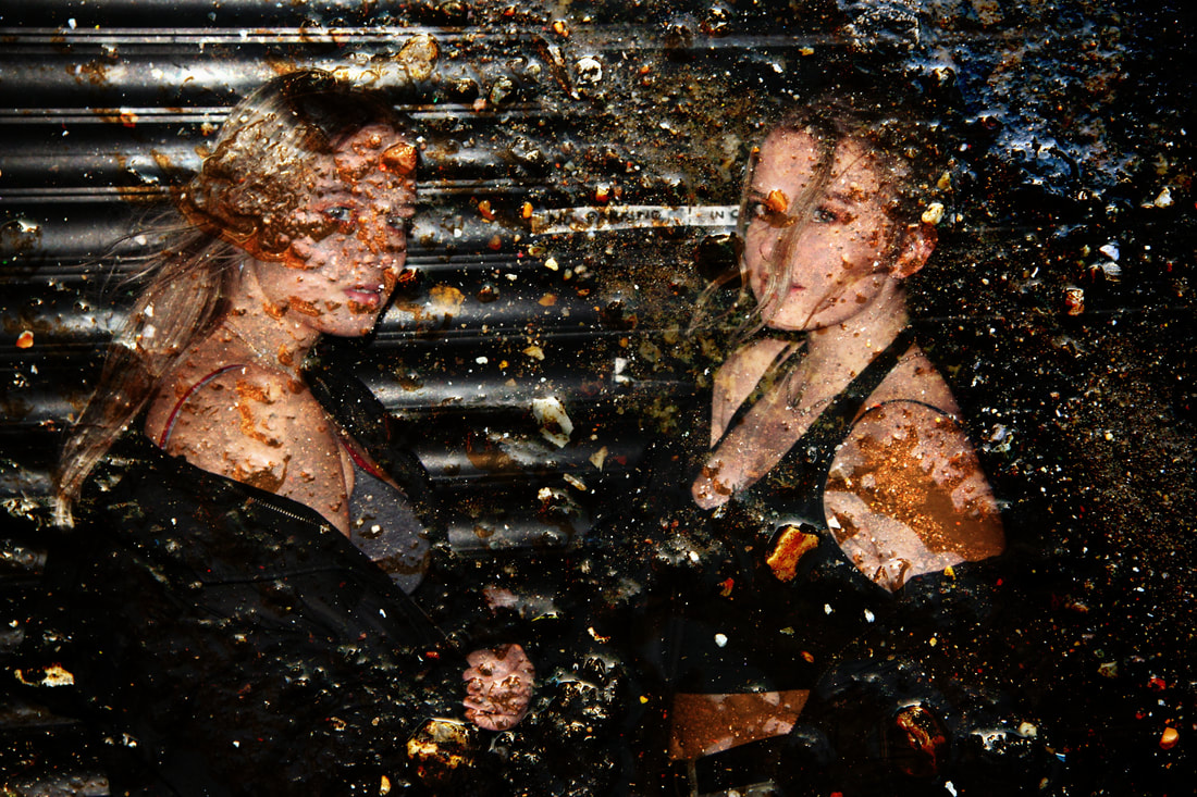
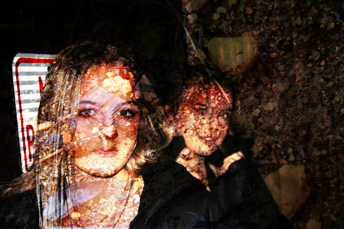
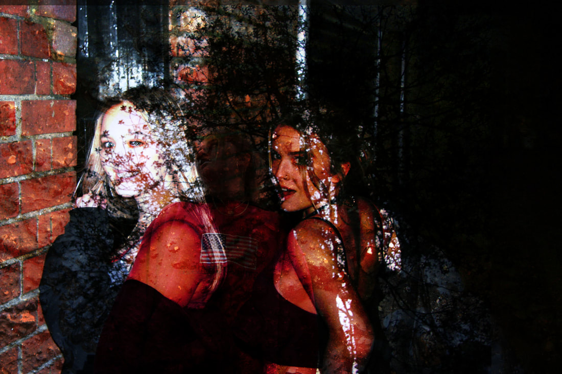
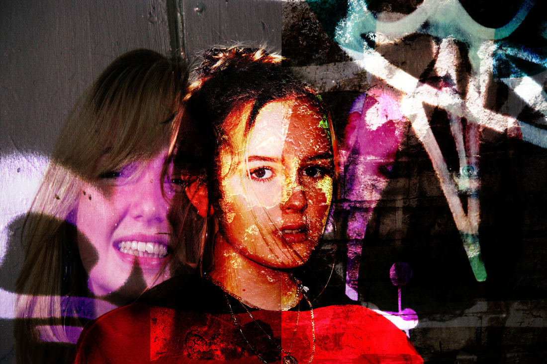
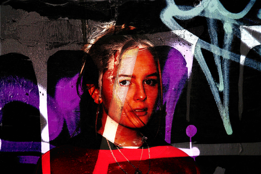
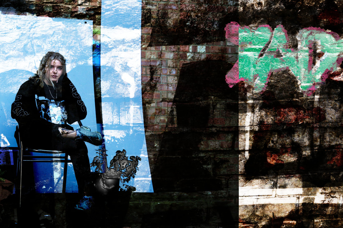
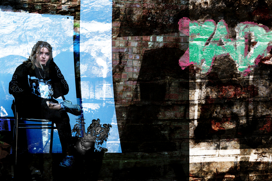
I think that what worked well in this image is the double exposure with the face. The three tones of graffiti in the background represent London's culture to an extent that creates a interesting pattern in this image. The thick white line visioned through the persons face creates a nice contrast with her skin tone. In terms of the GIF, I have selected all of the graffiti and filtered it out with a smudge effect. I have also made the GIF so it is shown to be flashing.

|
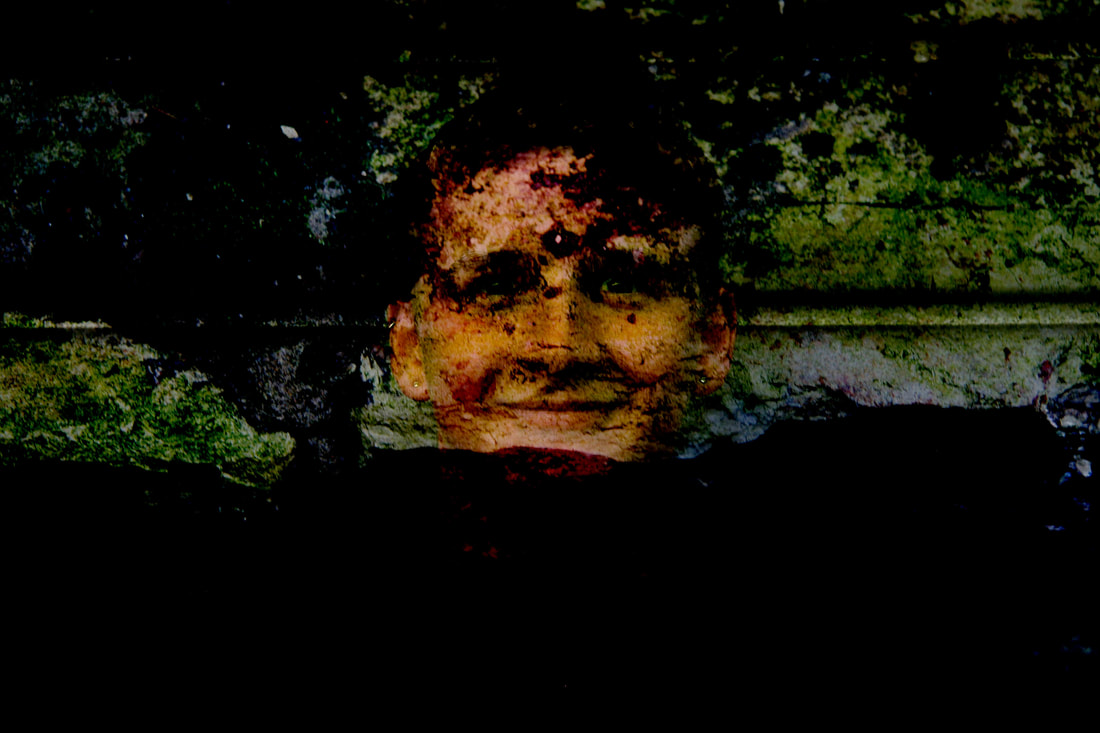
|
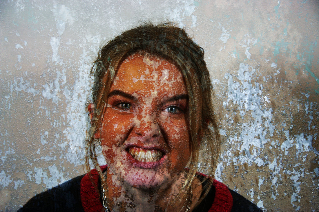
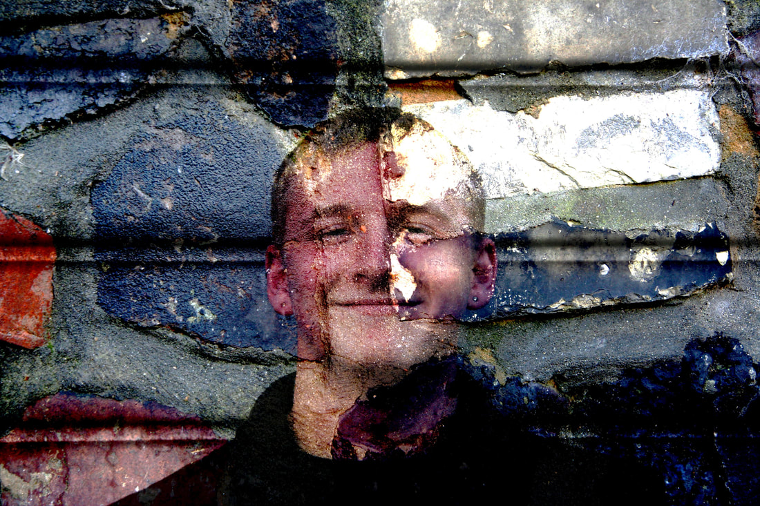
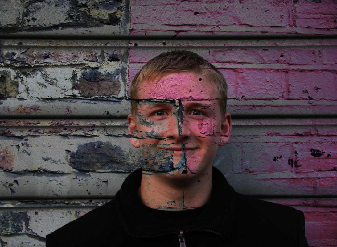
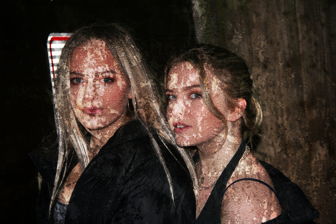
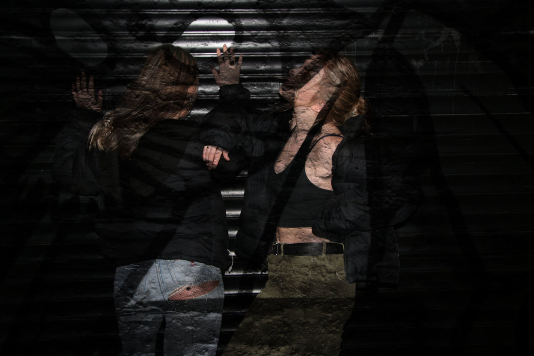
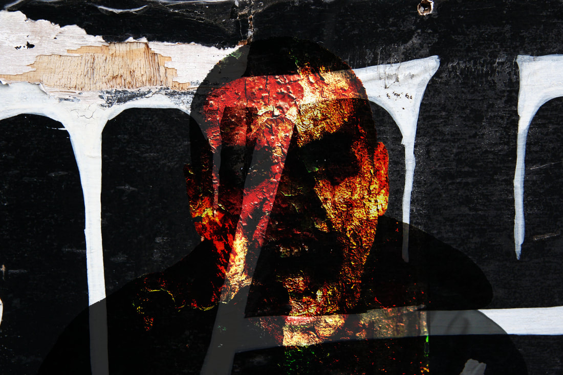
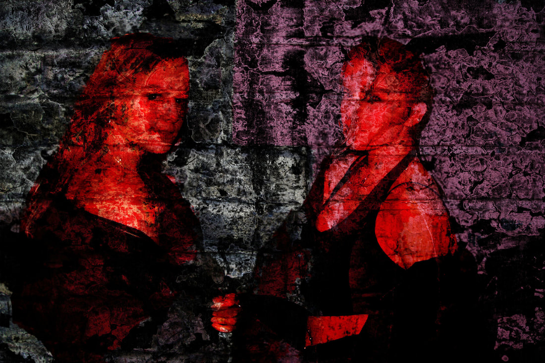
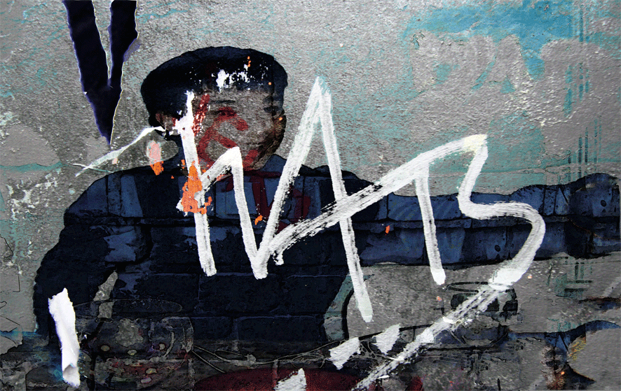
This image is the one that represents decay in society the best I think. This is because my friend, who is shown in the photo, is layered with two different textures that illustrate decay. The textures on his face are shown to be peeling off, suggesting that young people today in society are falling apart with the stresses and worries that they are forced to deal with. Also, bricks have been layered into his body very faintly as you can see through the dark blue top. This was added to represent strength which contrasts to the struggles that people deal with.
|

|
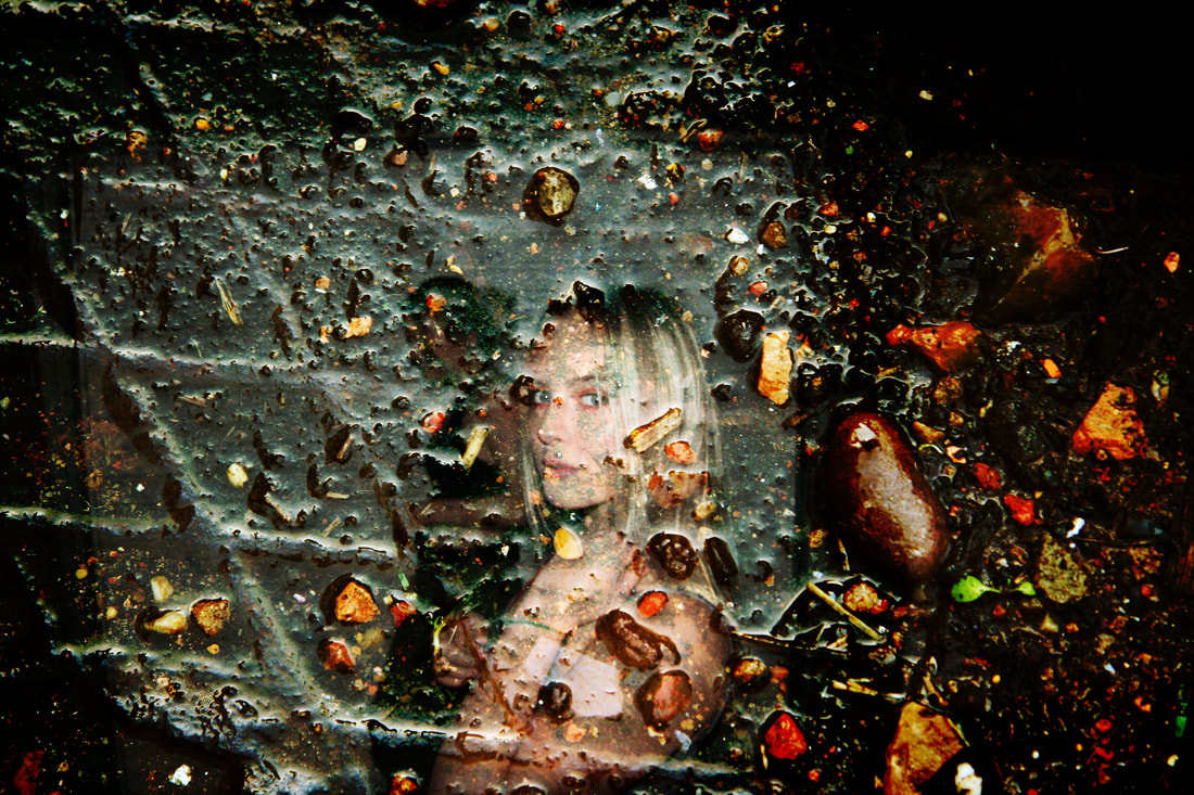
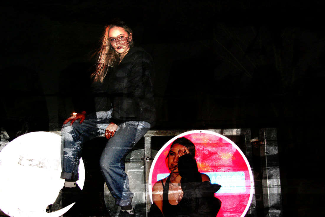
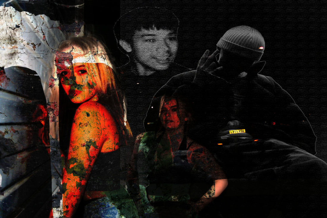
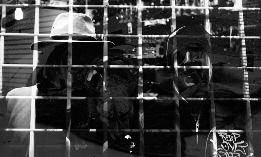
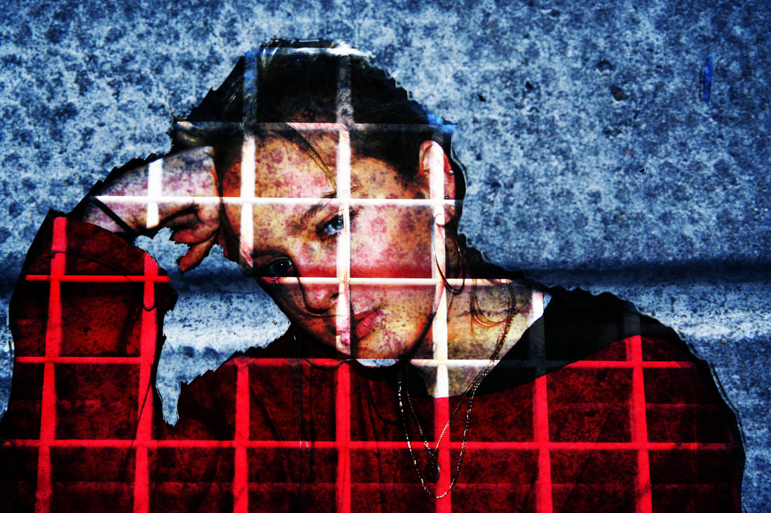
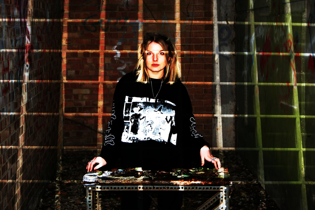
This final piece slightly differs from the image above. I have shot the photo in an abandoned location and exposed it with bars. I think that this combination works well as they both convey negativity and limitations. In the GIF, I used the image on the left multiple times, however, changing the colour many times creates a rainbow flashing effect when the GIF is finished. The colours represent positivity rather than the idea of being behind bars in a disgusting, abandoned and old environment.
|
|
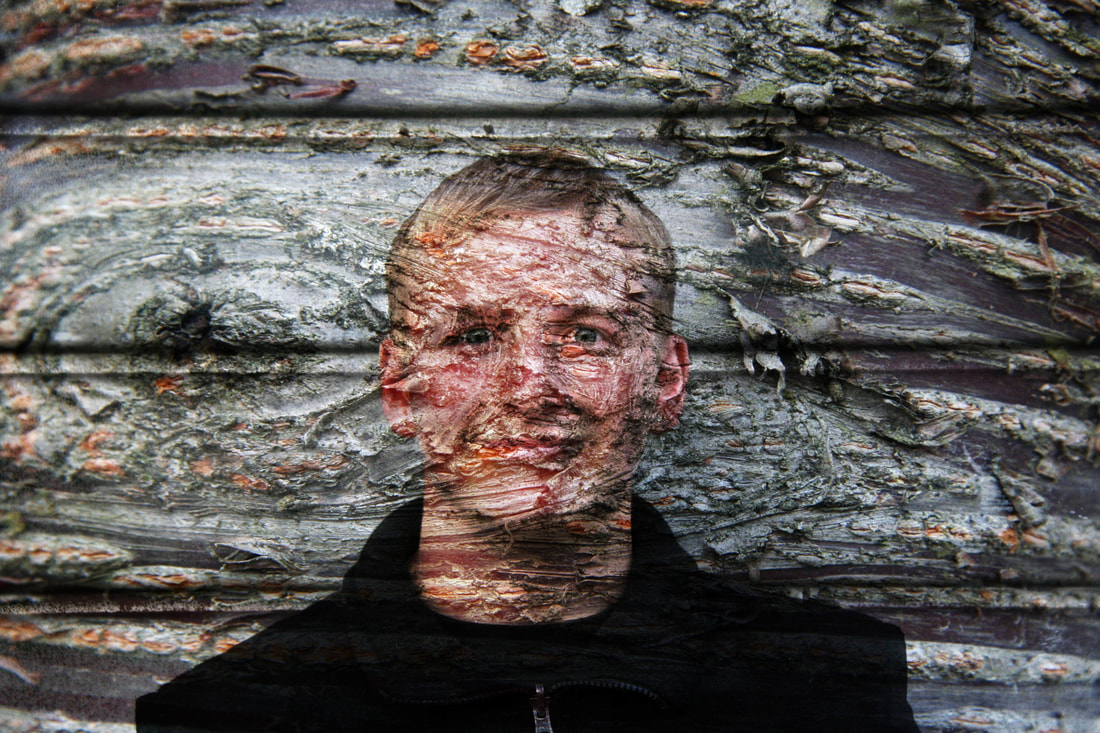
This was my last final piece. I think that this was one of my favourite out of set because I created around 3 layers and they all came together to create an image that shows decay in society. The GIF is presented with a black and white effect. This relates to my work that was inspired by Aaron Siskind. I think that the number of tones that are created in the original image make the GIF more effective as it creates a larger variety of black and white shades.
